Available for full-time Creative Director opportunities + select fractional engagements
Creative Director & Brand Strategist
Visionary. Translator. Creative Director.
I bring more than 15 years of experience translating complex ideas into clear, compelling creative experiences. My work spans brand strategy, integrated campaigns, digital experiences, and visual communications.
I lead through clarity, collaboration, and creative problem-solving—connecting business objectives with thoughtful execution and helping organizations move from vision to delivery.
Leadership snapshot: Creative Team Leadership, Brand Management, Creative Direction
Creative Team LeadershipBrand ManagementCreative DirectionCreative Team LeadershipBrand ManagementCreative DirectionCreative Team LeadershipBrand ManagementCreative DirectionCreative Team LeadershipBrand ManagementCreative DirectionCreative Team LeadershipBrand ManagementCreative DirectionCreative Team LeadershipBrand ManagementCreative Direction
Meet Nina: brand intro video
Visionary. Translator. Creative Director.
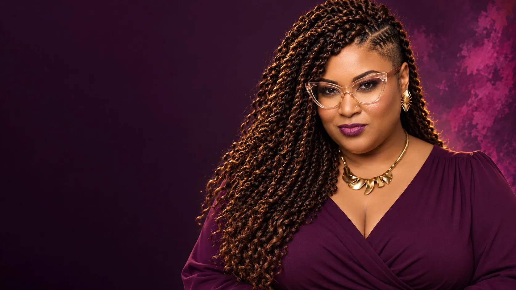
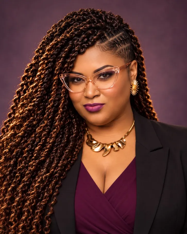
Nina Simmons, Creative Director and Brand Strategist, shown in a portrait.
15+ years of creative leadership, from concept through launch.
Selected client experience: Atlanta Black Chambers, Berkshire Hathaway HomeServices Georgia Properties, TK Elevator, Morris Brown College Foundation, Hilton Alexandria Mark Center, and Park Avenue Events. Creative direction, brand strategy, and brand management.
Your vision. Translated. Created. Delivered.
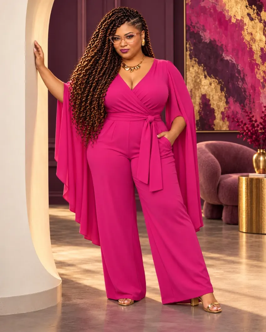
“I believe clarity creates movement,” beside a full-length portrait of Nina in a fuchsia jumpsuit.
The Nina Simmons logo, “Let’s build what’s next,” and ninasimmons.com.
Sound: upbeat instrumental music, no lyrics or speech. It builds through the client logos and fades out at the end.
A LITTLE ABOUT ME
A creative leader with more than 15 years of experience.
I am a Creative Director and Brand Strategist. I help organizations build brands people trust, and I lead the teams that bring those brands to life.
Explore my roles, education, and professional development.
Testimonials
Kind words.
“She became more than my graphic designer. She became a trusted creative and visual partner. Having Nina help turn those ideas into something people can actually see, understand, and connect with has been invaluable.”
Shirley Xavier Founder, YE Foundation & The Xchange Agency
“Nina is more than a graphic designer. She is a valued creative partner and thought provoker who helps transform ideas into meaningful visual experiences.”
Rich Wilkins President & CEO, Rich Speaks Now
“She gave me more than a visual direction. She gave me a framework for presenting myself with greater clarity and confidence as I step into this next chapter.”
Joy Warren Founder & Chief Strategist, Virtual Latitude
“She shines when she’s developing a new brand, reimagining an organization’s look and feel, or developing a fresh creative direction.”
Andrea TheoJohn President, The ADS Agency
“Nina is truly a visionary. She heard me and understood me and what I wanted for my brand. She still does.”
Zaneta James Owner, Cheveux Vierges, LLC
CONNECT
Let’s Build What’s Next.
Let’s talk about creative director roles, fractional leadership, and collaborations.
People rarely need more ideas. They need someone who can listen closely, see what matters, and turn possibility into a direction people can understand and act on.
Professional bio
Hey, I'm Nina.
I'm a Creative Director, Brand Strategist, and visual artist with more than 15 years of experience turning ideas into meaningful brand experiences.
My work sits at the intersection of business strategy, creative direction, and visual storytelling. I've led brand development, creative campaigns, and marketing initiatives, helping organizations clarify their message, strengthen their identity, and connect with the people they want to reach.
I enjoy seeing the big picture, connecting the dots, and bringing people together to move ideas forward. Whether I'm developing a brand strategy, directing a creative team, or guiding a campaign from concept to launch, I believe great work starts with understanding what matters and why.
Beyond client engagements, I serve on the Board of Directors of YE Foundation as Creative Director and Visual Identity Chair, contributing creative leadership and brand oversight in support of the organization’s mission and community initiatives.
Outside of my professional work, I'm an artist who believes self-expression creates opportunities for connection, understanding, and positive change.
At the heart of everything I do is a simple purpose: to create meaningful work, positively impact people, and leave something good behind.
My story
I started by making the work. Then I learned to lead what comes before it.
I have spent more than 15 years at the intersection of brand, design, strategy, and leadership. Over time, I became less interested in making one more thing and more interested in asking the questions that make the work matter: Who is this for? Why you? How do you help solve their problem?
That shift changed how I lead. Today, I help the people shaping the vision find the direction inside the idea, align the people around it, and give it form. The deliverable changes. The real work is clarity.
I listen first. Diagnose second. Direct third. Design last.
My process
From challenge to delivery.
01
Discover
Understand the challenge: the audience, the goal, and what success looks like.
02
Define
Establish direction: one central idea, a clear message, and the visual world around it.
03
Direct
Guide creative execution with designers, writers, vendors, and stakeholders.
04
Deliver
Launch, refine, and leave tools and systems the team can keep using.
Where I’m from
Gainesville, by way of Atlanta.
I am based in Gainesville, Florida, after years in Atlanta. Home keeps me grounded. Atlanta sharpened my ambition, expanded my creative community, and taught me how much stronger the work becomes when different perspectives share the room.
Why I do what I do
Because a good idea deserves more than decoration.
It deserves a clear strategy, a strong creative point of view, and a team that knows where it is going. I love the moment creative chaos becomes a shared direction and people can finally see what to do next.
Creative leadership
How I lead the work.
Clear direction. Honest questions. High standards. Enough room for talented people to do what they do best.
01
Start with meaning.
Before we choose a format, channel, or look, we get clear on the purpose, the people, and the outcome.
02
Make direction usable.
A vision only helps when people can make decisions from it. I translate the big idea into priorities, standards, and clear next steps.
03
Give good people room.
I set the destination, clarify the guardrails, and trust the right people to bring their expertise to the work.
04
Ask the question behind the request.
The first ask is not always the real need. I listen for the business problem, the audience tension, and the opportunity underneath it.
05
Protect the team and the standard.
I believe in candid feedback, visible priorities, sustainable pace, and removing the friction that keeps good work from getting done.
06
Finish what matters.
Ideas are only powerful when they move. I keep strategy, people, and execution connected until the vision becomes real.
Personality
Idealistic at heart. Driven in practice.
Myers-Briggs
INFP
The Mediator: creative, empathetic, open-minded, and grounded in authenticity.
Enneagram
Type 3
The Achiever: goal-oriented, adaptable, and motivated to turn potential into meaningful accomplishment.
Atlanta Black Chambers:Creative direction across a multi-program organization.
Atlanta Black Chambers serves 500+ member businesses through programs, events, and advocacy. For more than seven years I’ve led its creative direction as fractional creative lead, building the brand system, tools, and training that let a small team produce consistent work at the pace of a busy calendar.
ABC brand film (54 sec, music, no narration)
02 Project Overview
Client
Atlanta Black Chambers
Role
Creative Director & Brand Strategist
Industry
Business advocacy · Membership organization
Engagement
Fractional creative lead, 7+ years
Scope
Creative Direction · Brand Systems · Creative Operations · Team Enablement
Creative Leadership
Partner with executive leadership and the Marketing Director to translate organizational initiatives into creative concepts and visual communications. Lead research, concept development, art direction, and design execution, establishing the visual direction for campaigns, programs, and events. Collaborate with multidisciplinary creative contributors, develop reusable design templates, and provide creative review and final approval of team-produced materials before publication.
Impact
Established consistent visual standards across organizational communications and developed reusable creative assets that support efficient collaboration, brand consistency, and ongoing marketing execution.
Leadership scope
Executive Collaboration
President & CEO, Executive Director, Marketing Director
Board Engagement
Meetings and creative collaboration with members of the Board of Directors
Creative Strategy, Art Direction, Brand Stewardship, Campaign Development, Creative Production
03 The Challenge
Support a growing portfolio of organizational programs and events, each with distinct audiences and communication needs, while maintaining a consistent and recognizable Atlanta Black Chambers brand.
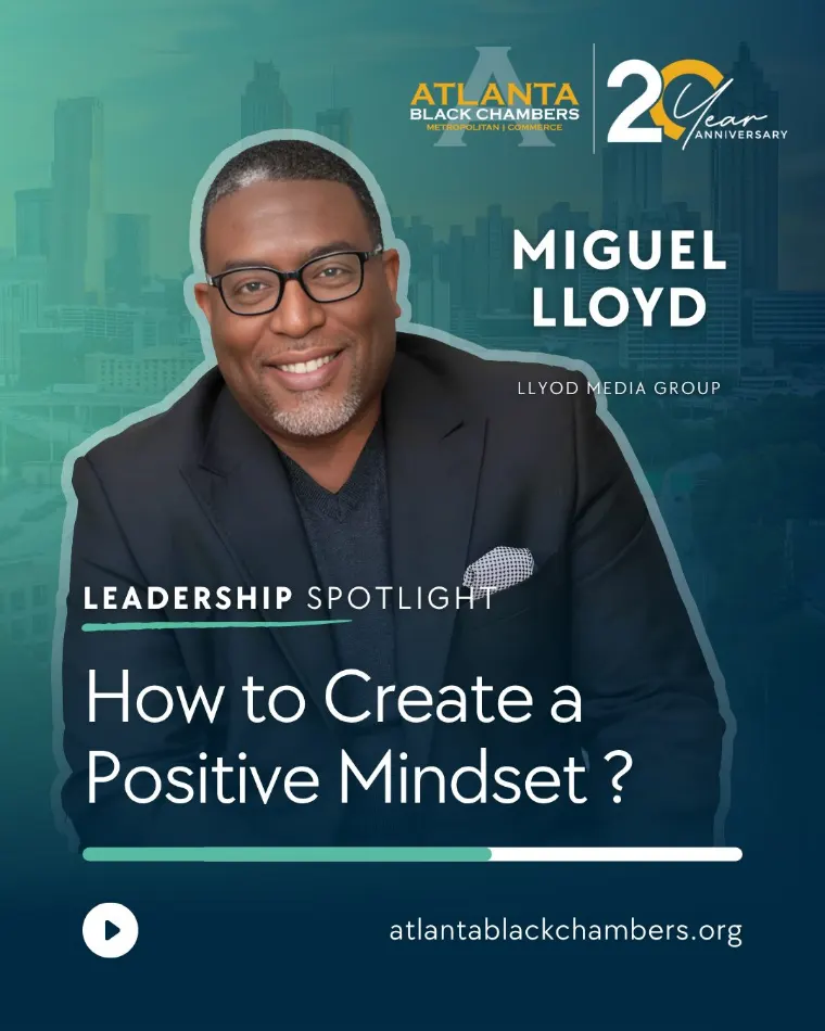
Leadership Spotlight social series
04 My Approach
I translate leadership’s ideas and program objectives into visual concepts through research, creative exploration, and art direction. For each initiative, I establish the look and feel, develop the initial creative assets, and build reusable templates that support ongoing marketing.
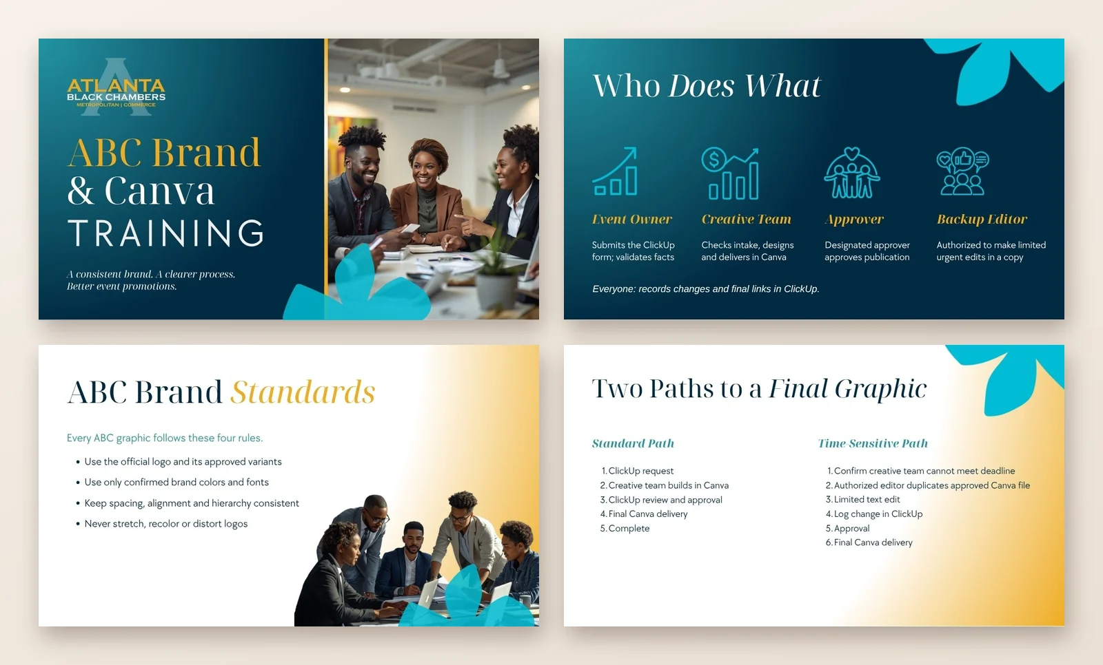
I also wrote and led “Create Boldly, Brand Correctly” training so the team could create on-brand work without waiting on me.
05 How the Work Moves
From an executive request to a system the team can run.
01
Receive the business objective
Executive leadership or the Marketing Director introduces an initiative, event, or organizational need.
02
Research and conceptualize
I research the subject, explore creative approaches, and determine the right visual direction.
03
Establish the creative direction
I make the decisions on look, feel, imagery, typography, composition, and overall visual communication, incorporating leadership input when appropriate.
04
Develop and execute
I create the final designs, or build the templates and visual standards other team members use.
05
Enable consistent execution
I provide the creative foundation for ongoing communications, so every initiative carries a cohesive visual presence.
06 The Work
The system
One identity on navy, gold, and teal, carried from the mission statement to every channel.
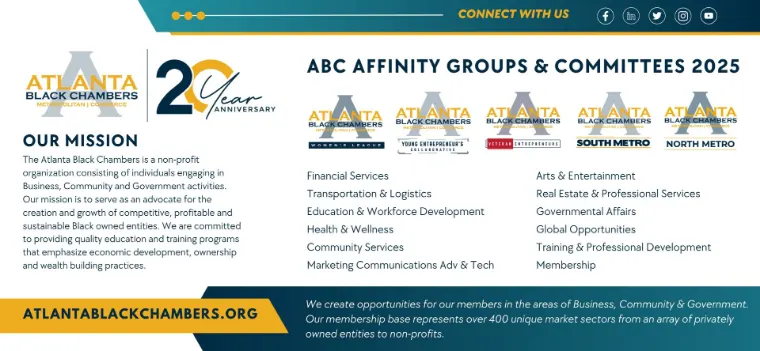
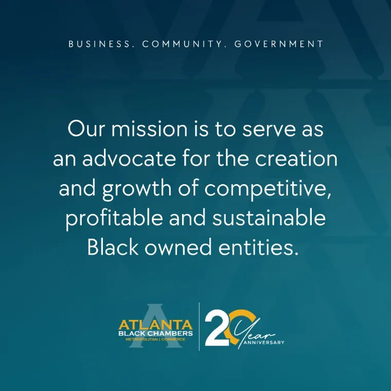
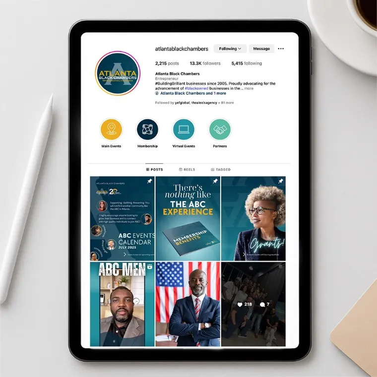
Affinity Groups and Committees 2025 one-pagerMission statement brand graphicInstagram presence
The Open House presentation
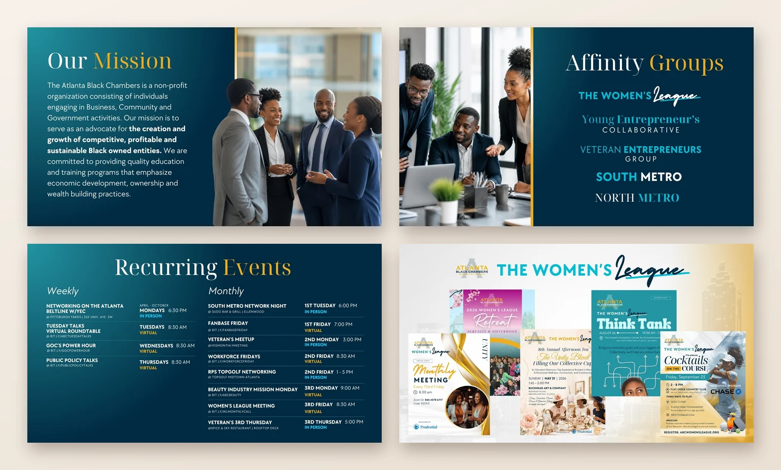
The chamber’s story for prospective members in one live deck: leadership, mission, affinity groups, committees, and a full calendar of recurring events.
Mission, affinity groups, recurring events, and the Women’s League
Program 01: Women’s League
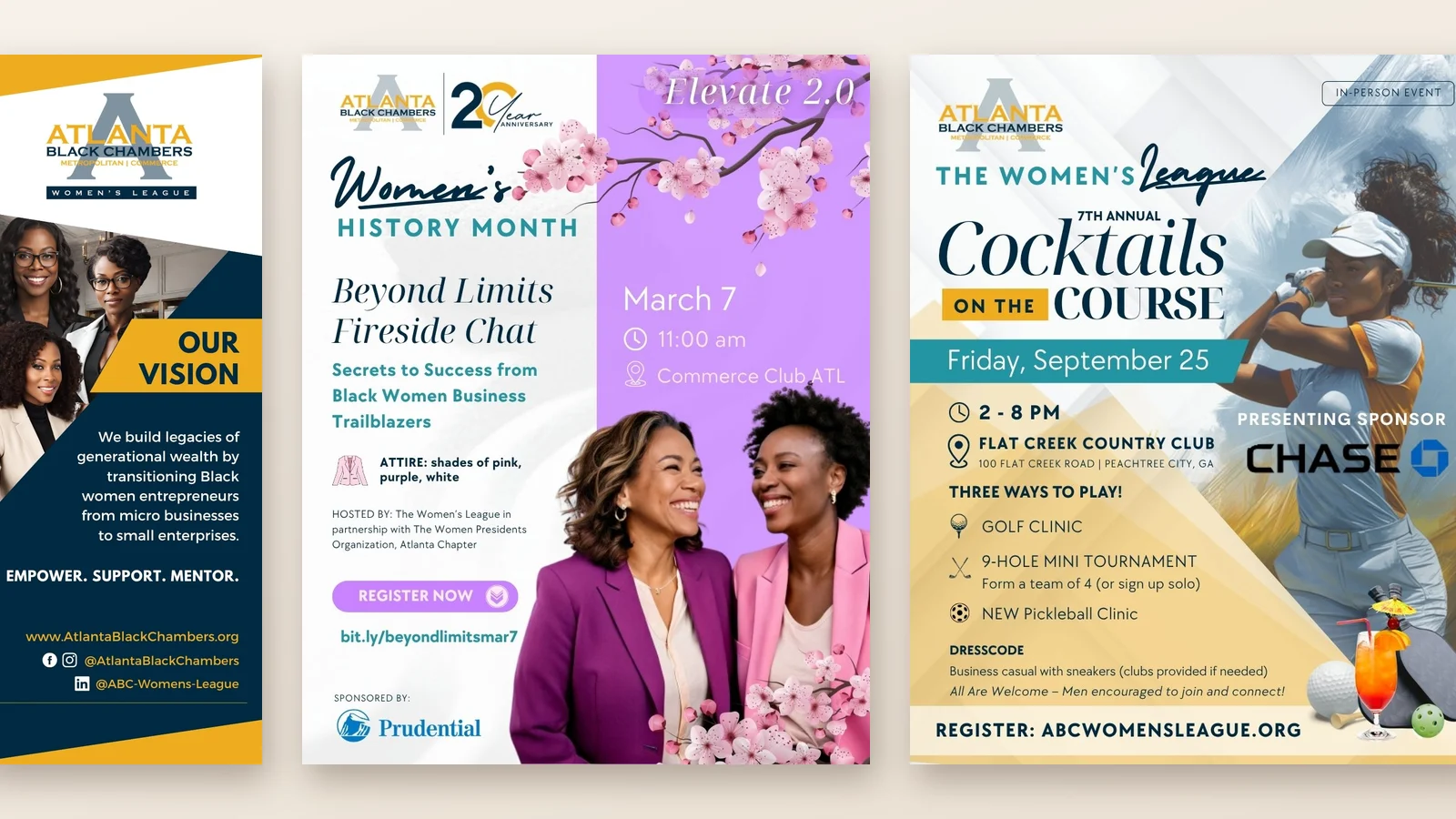
Audience positioning. A distinct identity for ABC’s community of Black women business owners, in pink, plum, and gold, still clearly part of the chamber’s brand family.
Retractable banner, fireside chat, and Cocktails on the Course
Program 02: Business Readiness
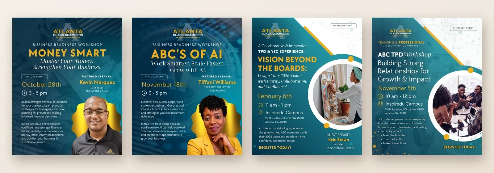
Campaign development. One workshop concept extended across sessions, speakers, and committees, from the Money Smart and ABC’s of AI webinars to in-person professional development workshops like Vision Beyond the Boards.
Virtual webinars and in-person workshops
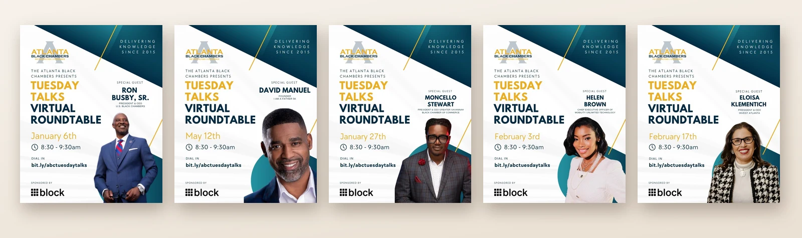
Program 03: Tuesday Talks
Repeatable systems. A weekly virtual roundtable needs a new graphic every week. I built one format the team updates for each speaker and date, so every edition launches on-brand without starting over.
One template, a new guest every week
Events and team enablement
The brand in the room, and the training behind it: I built the ABC Brand & Canva Training to define who requests, creates, and approves each piece, so the team can produce on-brand work without waiting on me.
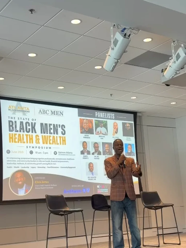
ABC Brand & Canva Training: roles, standards, and the path to an approved graphic2026 events: ABC Gala, Branditize, and the ABC Men SymposiumABC Men Symposium slide on stage, June 2026
07 The Impact
Developed distinct yet cohesive visual systems across multiple organizational programs, creating reusable assets that support consistent communications, team collaboration, and repeatable marketing execution.
Berkshire Hathaway HomeServices Georgia Properties:A national brand, made personal for 1,200+ agents.
At Berkshire Hathaway HomeServices Georgia Properties, I developed integrated creative for agent recruitment, personal branding, corporate communications, and marketing across a network of 1,200+ real estate professionals. The work balanced the consistency of an established national brand with the distinct needs of individual agents, internal teams, and brokerage leadership.
Developed agent-facing marketing, recruitment, and corporate communications within established brand standards, supporting a brokerage network of more than 1,200 agents.
Impact
Supported consistent brand representation and provided marketing materials that helped agents communicate their value and promote their businesses.
03 The Challenge
The brokerage needed its creative to do three jobs at once: attract new agents, bring existing agents into internal initiatives, and help each agent market themselves. Every audience needed its own message, and all of it had to stay within the standards of a national brand.
04 The Strategic Response
I treated the corporate brand as the fixed frame and the audience as the variable. Recruitment materials spoke to prospective agents, Listing Challenge promotions used prize incentives to drive participation, and personal branding gave each agent a distinct identity that still read as Berkshire Hathaway HomeServices. Training let agents create locally without breaking the system.
My role
As Senior Graphic Designer, I was the creative lead on this work and the most experienced designer on the team, working alongside my fellow designers. I was the link between marketing and the agent network, translating business and sales goals into campaigns, presentations, and tools. I led design for spring recruitment campaigns and Listing Challenges, developed personal branding for agents, including extensive work for Jennifer Evers, created luxury campaigns for distinct property segments, designed leadership presentations, and trained agents on the brand systems.
05 The Work
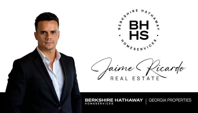
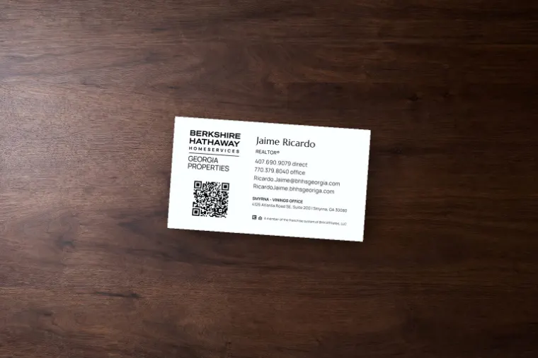
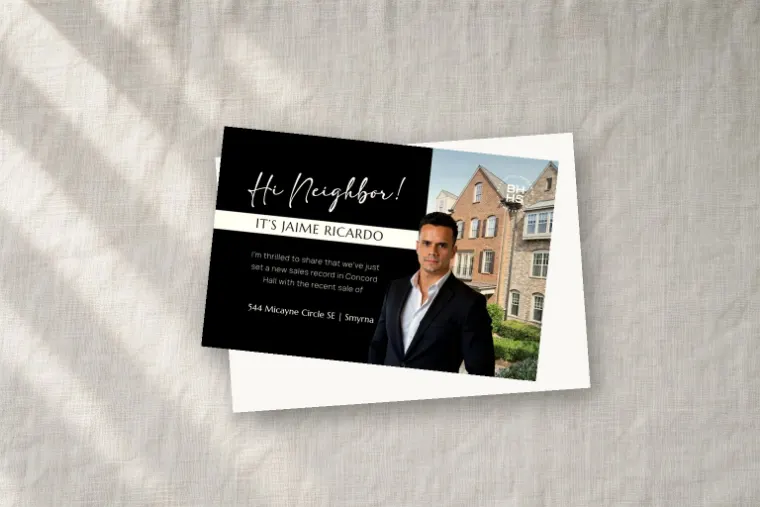
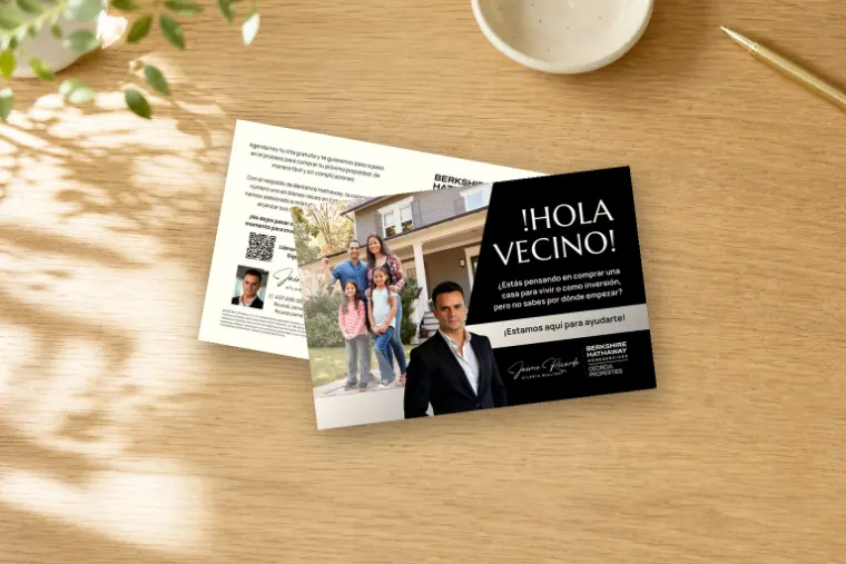
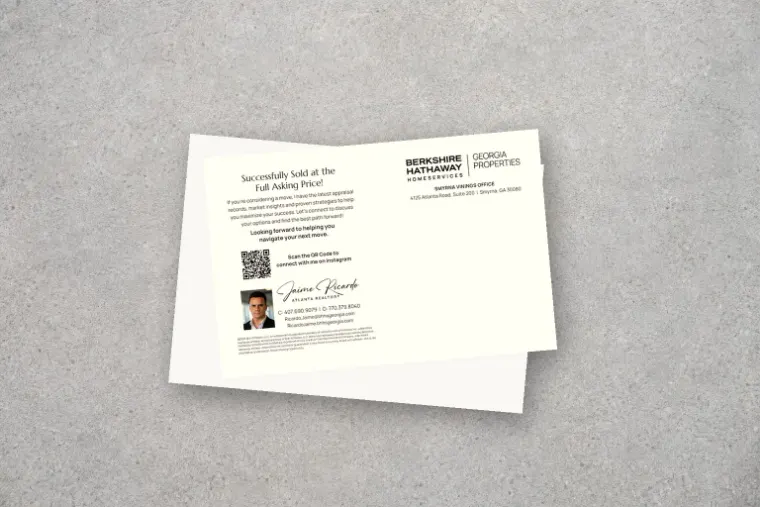
Jaime Ricardo
A bilingual agent brand, carried from signage and business cards to English and Spanish neighborhood mailers.
Luxury video branding: a listing video, short-form video, The Luxe Lowdown series, and neighborhood content for social.
Luxury listing videoBuy Invest Sell videoThe Luxe Lowdown series introThe Luxe Lowdown: The Art of First ImpressionsNorth Metro ATL as dog breeds
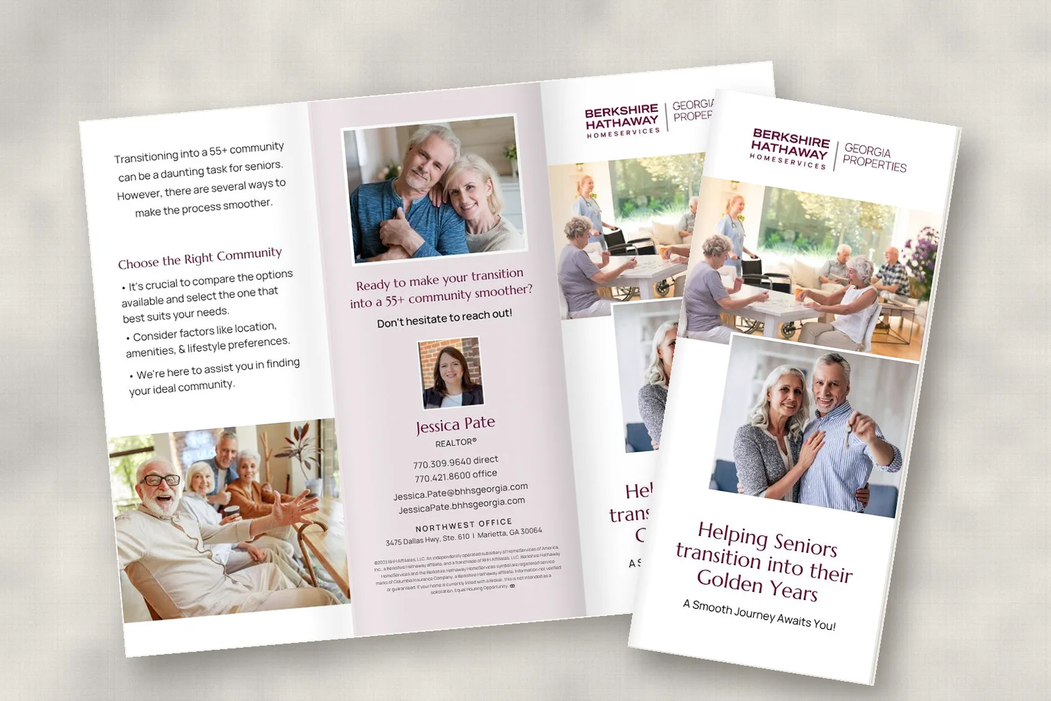
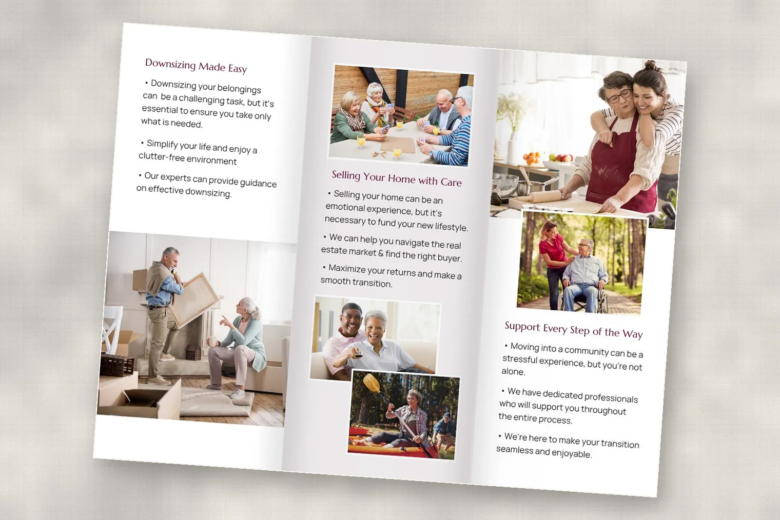
Jessica Pate
A 55+ community brochure about downsizing and selling with care.
Tri-fold brochure, outside and coverTri-fold brochure, inside
06 The Impact
The personal-branding work contributed to a reported 15% increase in lead conversion. The brokerage gained a consistent set of recruitment, participation, and leadership materials, and agents gained branding and tools they could use with confidence on their own.
15%reported increase in lead conversion from personal-branding work
1,200+real estate professionals supported
What I’d Do Next
Four years inside the brokerage left me with a question the in-house work never asked: how would I recruit the next generation of agents? See the pitch: Your Next Move
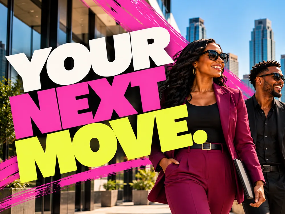
Your Next Move:A recruitment pitch for the next generation of agents.
Legacy brokerages are known for trust and stability. To a new generation of agents, that can read as traditional. This pitch keeps the trust and adds ambition, repositioning an established brokerage as a career destination.
Independent pitch, informed by my years at Berkshire Hathaway HomeServices Georgia Properties. Not commissioned or endorsed by the brokerage.
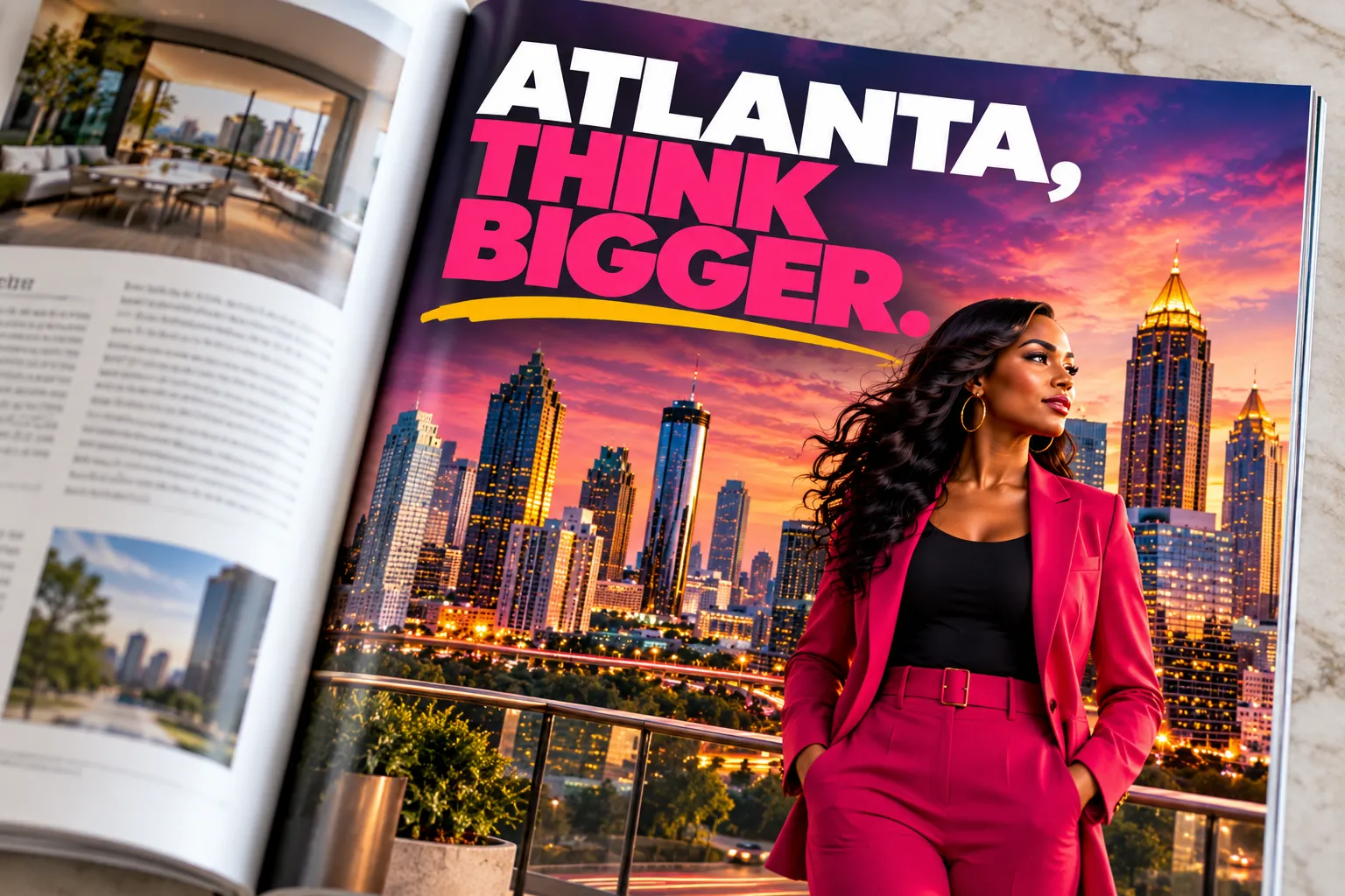
Hero campaign graphic, the anchor for every execution
02 Project Overview
Type
Independent pitch
Industry
Real estate, Atlanta
Audience
Emerging and established agents
Scope
Strategy · Creative Direction · Pitch Film · Integrated Campaign
Creative Leadership
Developed the campaign’s creative concept and visual direction, translating its central message into a distinctive, coordinated set of campaign executions.
Impact
Demonstrated how one creative idea can extend across multiple touchpoints while maintaining a consistent message and recognizable visual identity.
The pitch film, 1:23. Written, produced, and voiced by me. Captions available.
The Question. On screen: “Atlanta. A city that never stops moving.” Voiceover: “Every day you help people make life-changing moves. But when was the last time you thought about yours?”
The Ambition. On screen: “You’ve worked hard to get here.” Voiceover: “You’ve built relationships, earned trust, created opportunities. And you know there’s more ahead.”
The Proof. On screen: “Your work speaks for itself.” Voiceover: “You know what it takes to move people forward. So imagine what could happen when that same ambition is invested in your own future.”
The Opportunity. On screen: “Growth doesn’t happen alone.” Voiceover: “The right environment can change what’s possible. New connections, fresh perspectives. People who see where you’re going, and want to help you get there.”
The Invitation. On screen: “Your next move.” and “The future is yours to build.” Voiceover: “Your experience brought you here. Your ambition will take you further.”
Sign-off. On screen: “Your next move. Make it count. Agents, let’s talk about your next move.” Voiceover: “Your next move, make it count.”
03 The Challenge
Brokerage recruitment usually sells the brokerage: its size, its tools, its name. Ambitious agents weigh a brokerage the way they’d weigh any career move, and newer firms win them with energy. The message had to feel current and ambitious without losing the credibility that makes an established name worth joining.
04 The Insight
Agents are in business for themselves, but they don’t want to build alone. Supporting 1,200+ of them at a national brokerage, I saw what kept people there: the referral network, experienced agents down the hall who would teach them, and an office they came into just to connect. The pitch is built on those three truths, not on invented perks.
05 The Idea
Agents spend their careers helping clients make life-changing moves. This campaign turns the question around and asks about theirs. “Your next move” works twice: it speaks the agent’s own language and opens a career conversation instead of a sales pitch. Every headline names agents in the first seconds, because the line alone could read as a home-buying ad.
06 The Direction
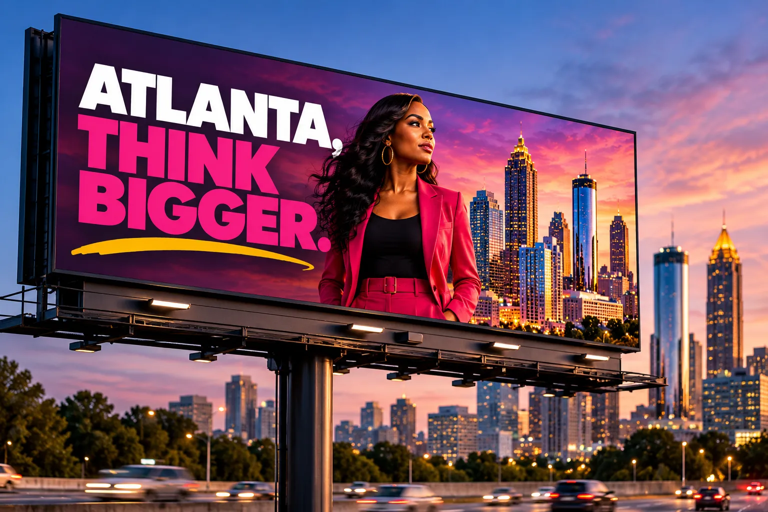
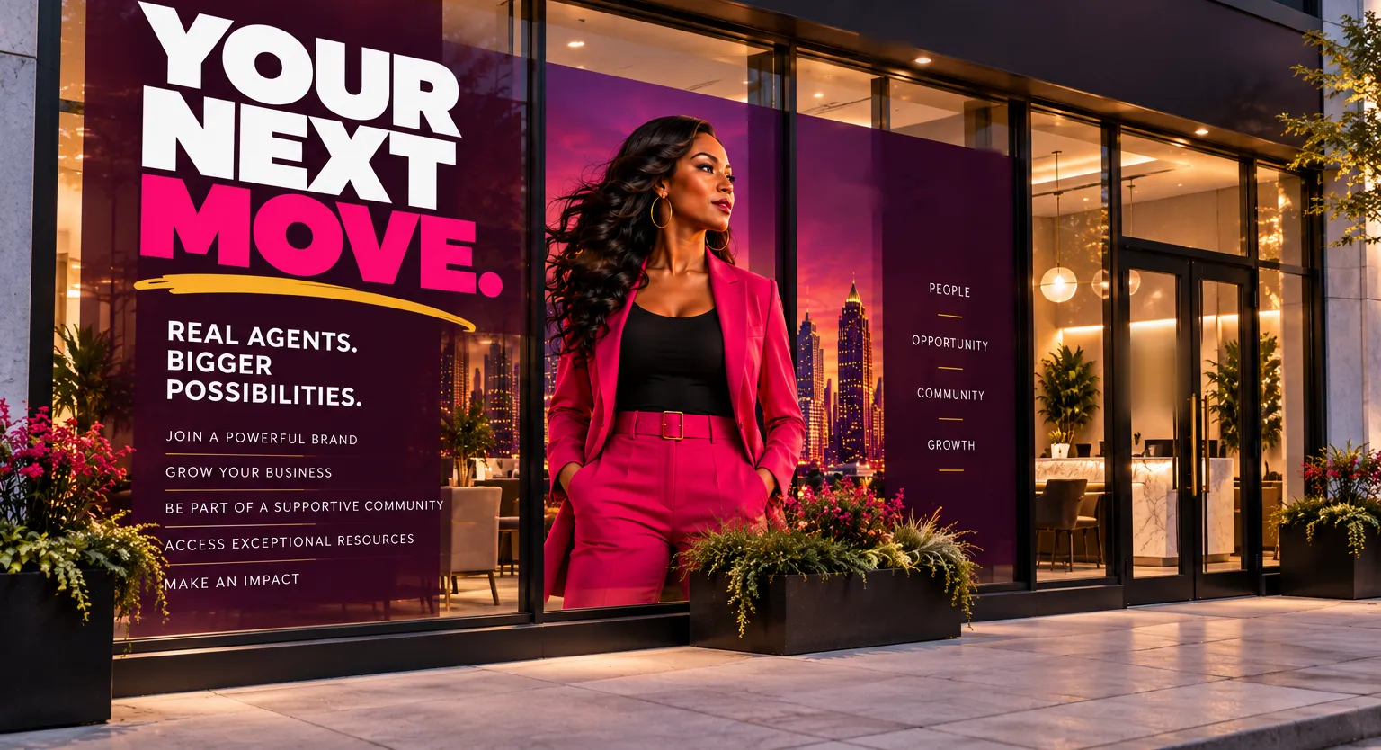
Fashion-campaign energy instead of real estate convention: oversized type, hot pink against deep plum, a gold underline, and the same lead agent carried through every piece so the system reads as one campaign. In production, I’d cast working Atlanta agents and shoot on location, so the faces in the campaign are the people it recruits.
07 The Work
Awareness: outdoor and print
Atlanta billboardMagazine print adBrokerage window graphics
Interest: social and the reel
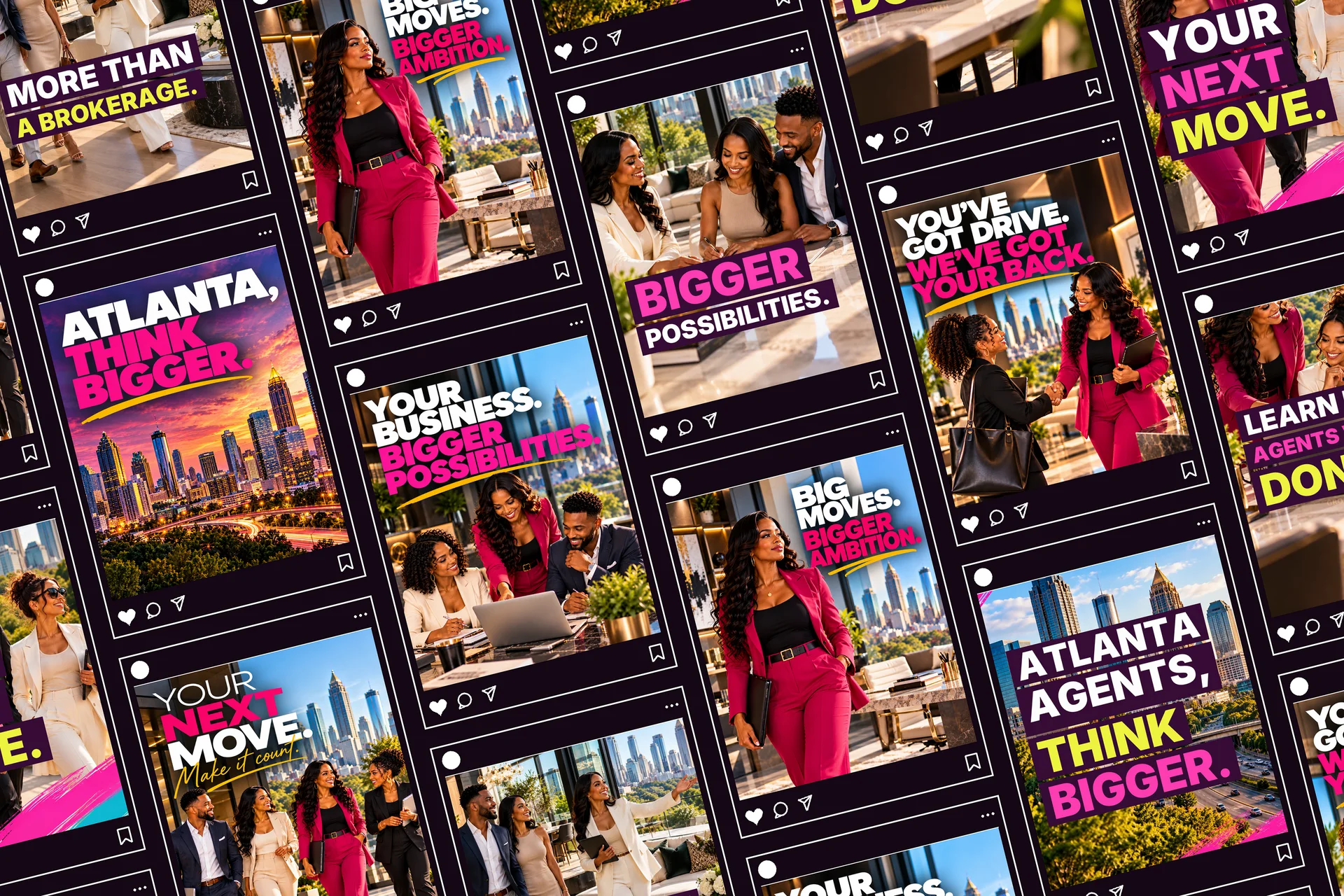
Five social ads and reel frames in the feed: one identity, five moments in an agent’s career
15-second recruitment reel for Instagram
On-screen text, set to music:
“Atlanta agents, think bigger.” “Your next move.” “More than a brokerage.” “Bigger possibilities.” “Learn from agents who’ve done it.” “Your next move. Make it count. Agents, let’s talk about your next move.”
The 15-second reel
Six scenes cut to the beat at 120 BPM: Atlanta, the walk, the tour, the closing, the mentor, and the reveal. “Agents” lands in the first two seconds, so no one mistakes it for a home-buying ad, and the music drop hits on the final line.
Conversion: landing page, email, and event
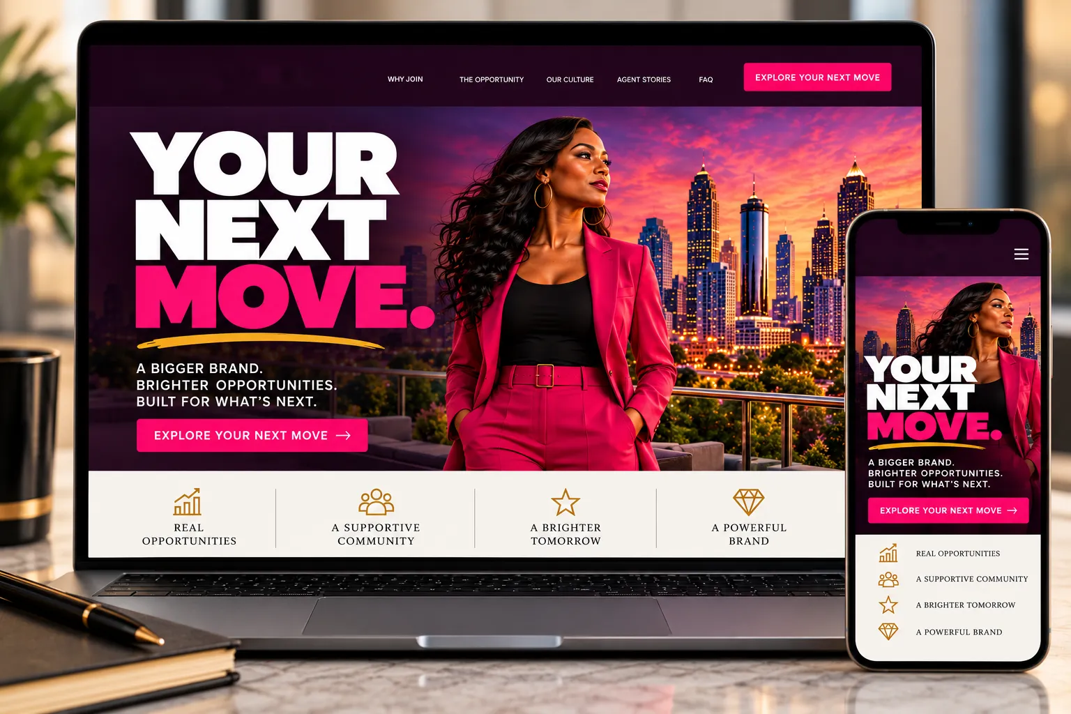
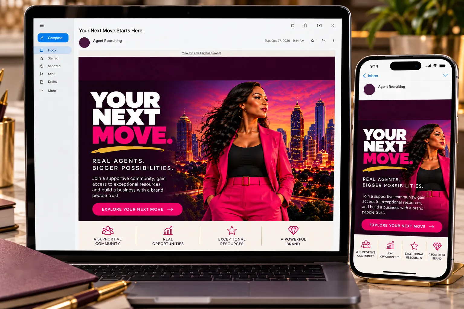
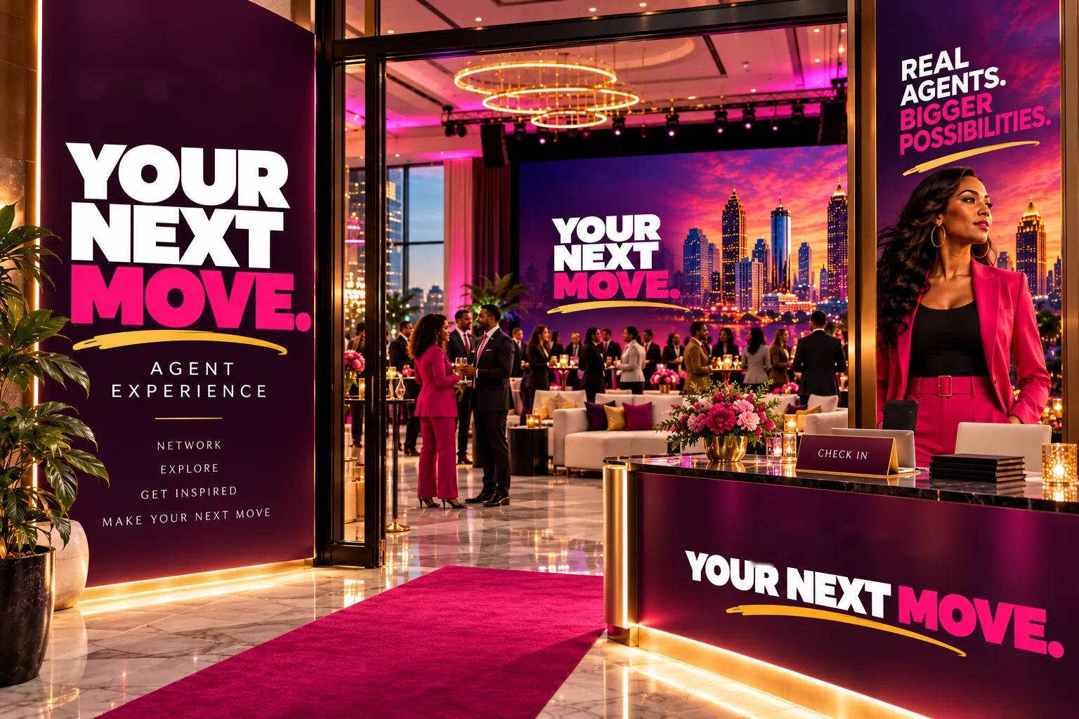
Recruitment landing pageRecruitment emailThe Next Move: An Agent Experience, an invitation-only recruitment event
Strategy: the presentation
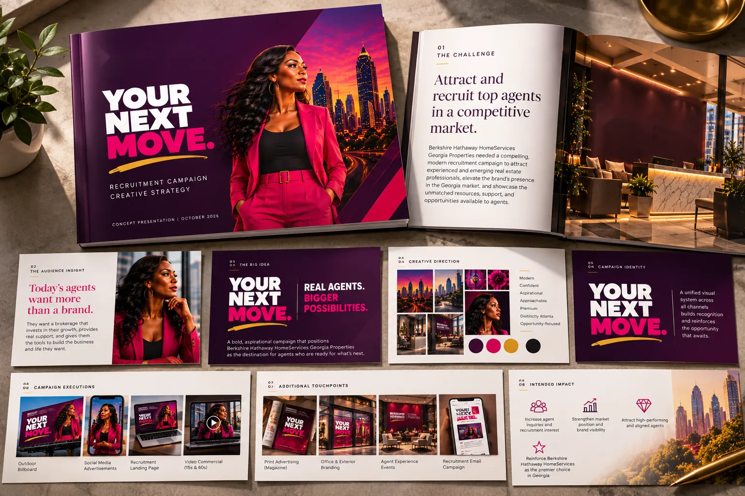
Creative strategy presentation, from challenge to intended impact
08 Measuring Success
Creative that moves people. And business. The measurement framework connects campaign awareness to meaningful recruiting conversations.
01Qualified agent inquiriesPrimary business outcomeProspective agents who submit a recruitment inquiry and meet predefined qualification criteria.
02Landing page conversion rateDigital campaign effectivenessVisitors who complete an inquiry form or book a recruiting conversation.
03Agent Experience attendanceEngagement and relationship buildingProspective agents who attend the recruitment event, with follow-up tracking for recruiting conversations.
Proposed KPIs for an independent campaign concept. No actual campaign performance is claimed.
My Role
Strategy, concept, and creative direction across the full system: the pitch film (script, edit, and voiceover), a 15-second reel, the hero graphic, five social ads, a billboard, a magazine ad, window graphics, a recruitment landing page and email, an agent event activation, and the strategy presentation that ties them together.
Imagery generated with AI under my art direction. Original music made with Suno.
Park Avenue Events:Every celebration begins with an invitation.
Since 2017, I’ve been the design partner behind Park Avenue Events, the Atlanta event planning company founded by Hester Parks. I design the invitations that set the tone before a guest ever arrives, and the proposals and communications that help the business win the next event.
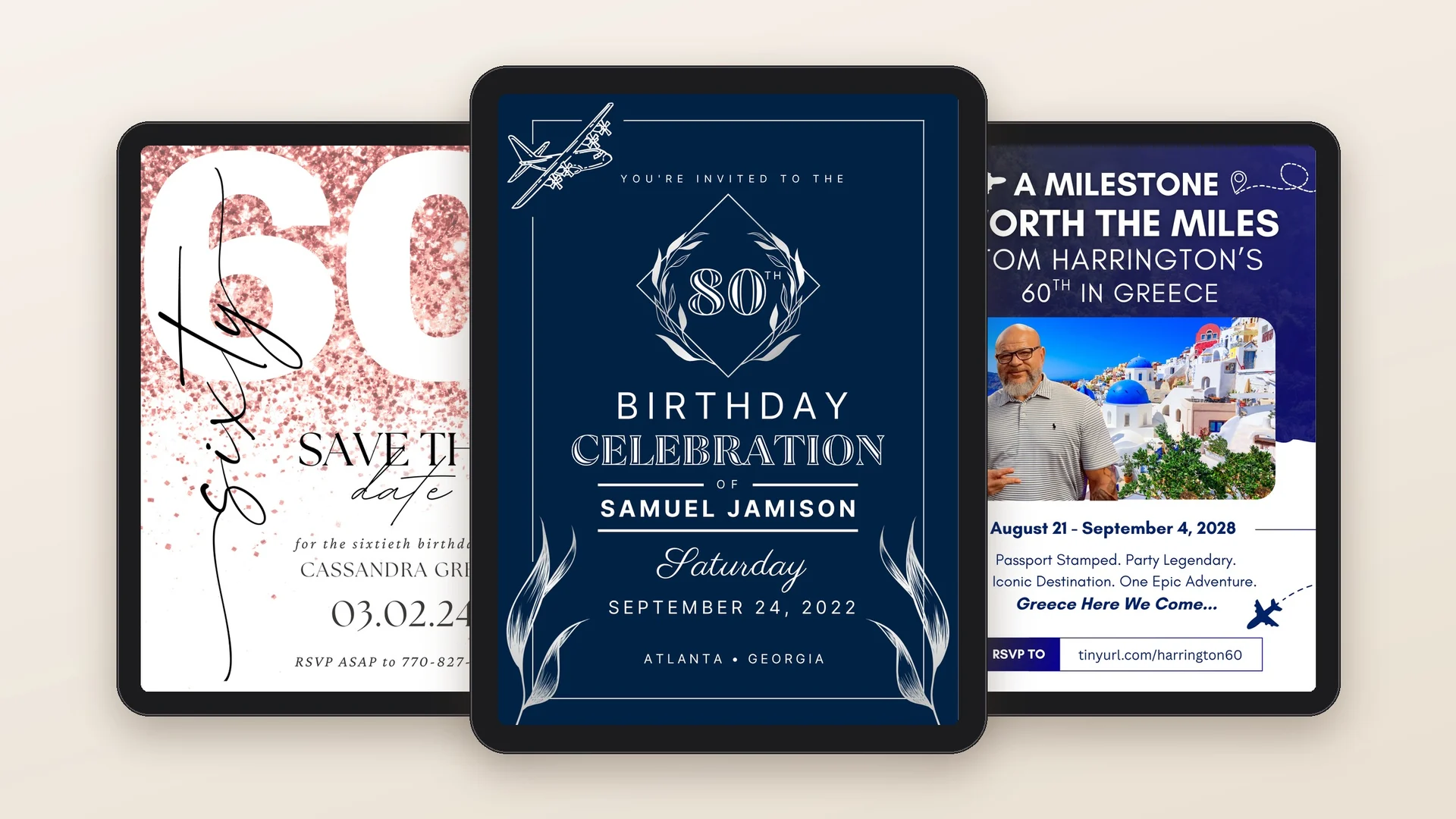
Three milestones, three personalities
02 Project Overview
Client
Park Avenue Events
Role
Lead Design Consultant & Assistant Event Planner
Partnership
Since 2017
Focus
Digital Invitations · Event Communications · Proposals & Brand Support
Creative Leadership
Served as Lead Design Consultant in a creative partnership dating to 2017, developing personalized event invitations, proposals, brand communications, and digital experiences in collaboration with event planner Hester Parks.
Impact
Helped translate diverse client visions into distinctive event communications while providing reliable creative support across years of celebrations and recurring client engagements.
03 The Creative Partnership
Nearly a decade of trust.
Hester plans the celebration. I help her client see it before it happens. Over the years that has meant invitations and save-the-dates, programs and event communications, client proposals, and brand materials for the business itself.
The partnership goes beyond the screen. As an assistant event planner, I’ve helped direct vendors on-site, offered décor ideas, and made sure the details we designed worked in the actual room.
04 The Work
01 An Invitation to Celebrate
A different personality for every guest of honor.
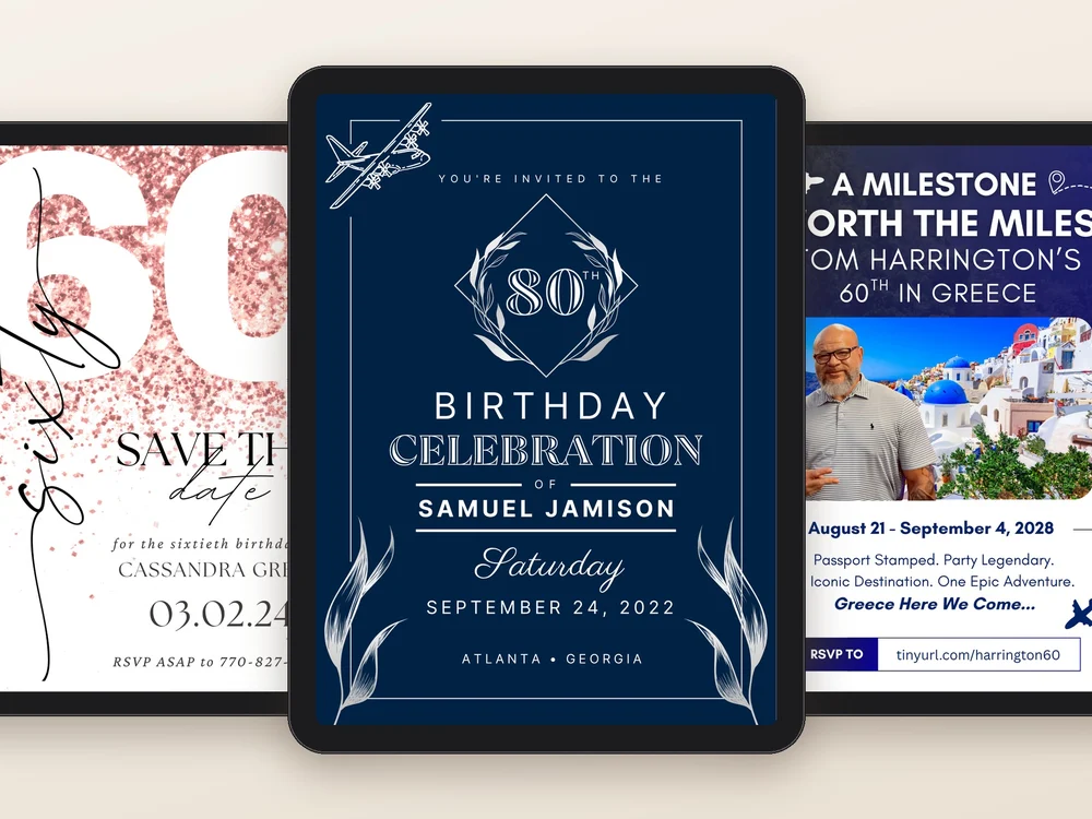
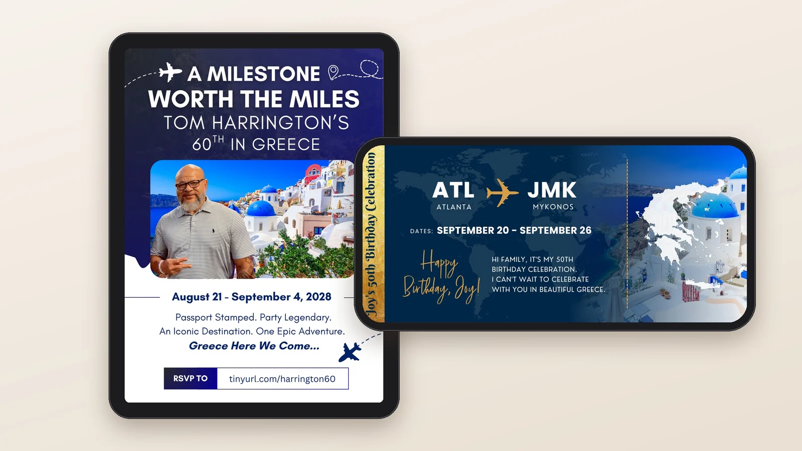
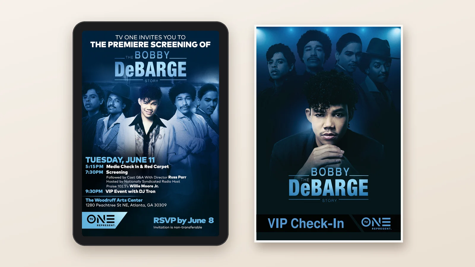
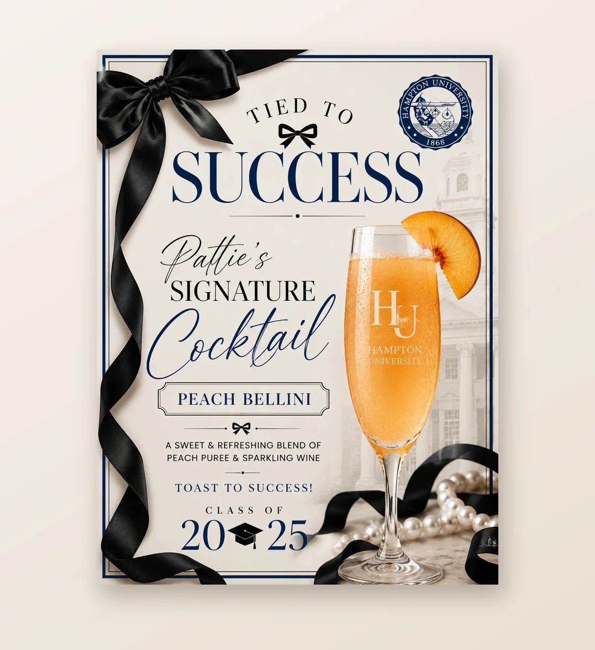
Milestone birthdays, destination celebrations, graduations, and weddings each start with the person at the center. An eightieth in navy and silver. A sixtieth in rose-gold glitter. Two trips to Greece: one an invitation “worth the miles,” the other a boarding pass from Atlanta to Mykonos. A Hampton graduate’s party, tied together with a signature cocktail. And in 2019, a red-carpet premiere for TV One, from the invitation to the VIP check-in sign at the door.
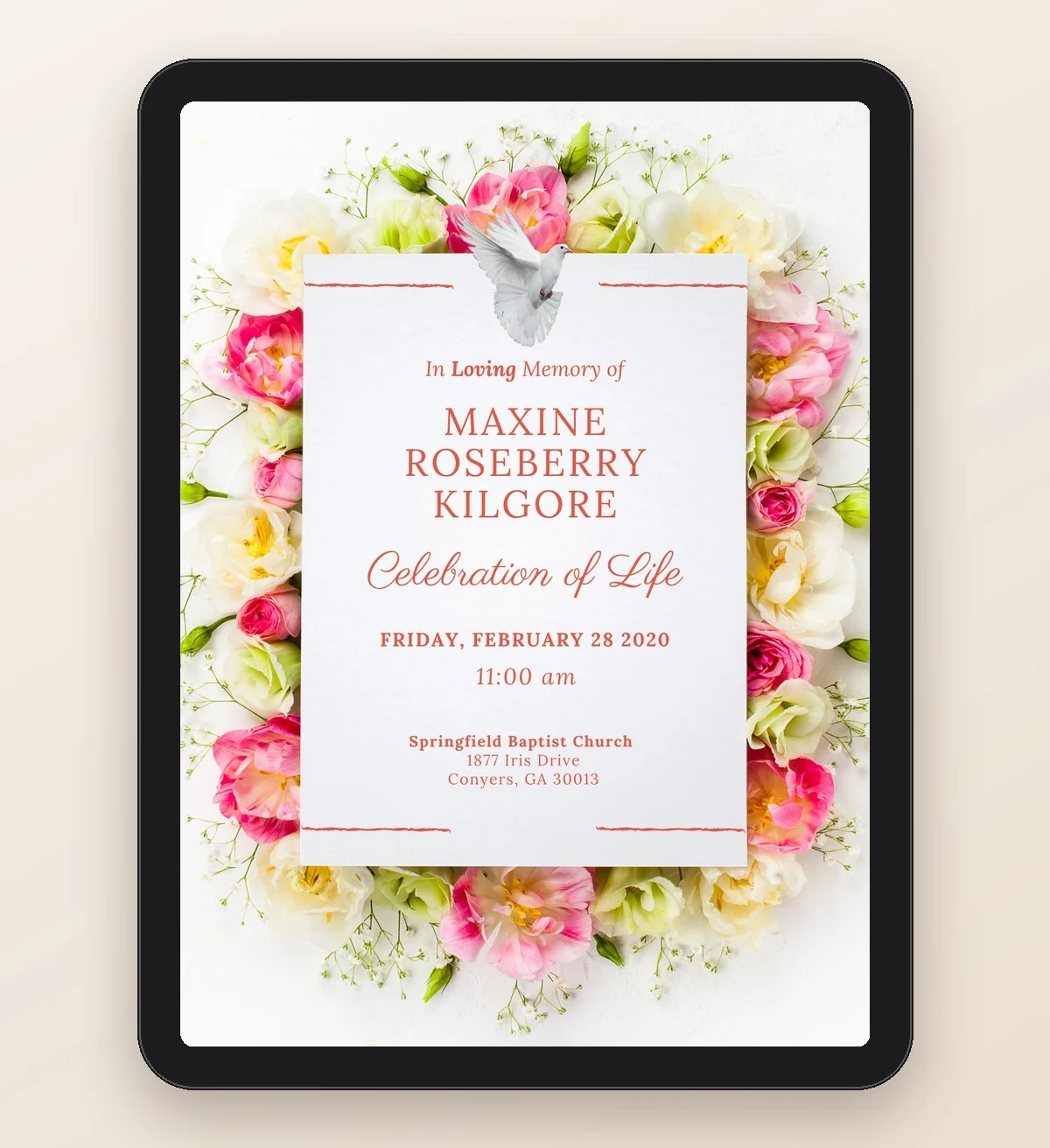
Not every occasion is a party. A celebration of life has to comfort as much as it informs, so soft florals and clear, gentle type let the family share the details with care.
Destination celebrations: an invitation and a boarding passTV One premiere of The Bobby DeBarge Story, 2019: invitation and VIP check-in signGraduation: Pattie’s signature cocktail, Class of 2025A celebration of life, designed with care
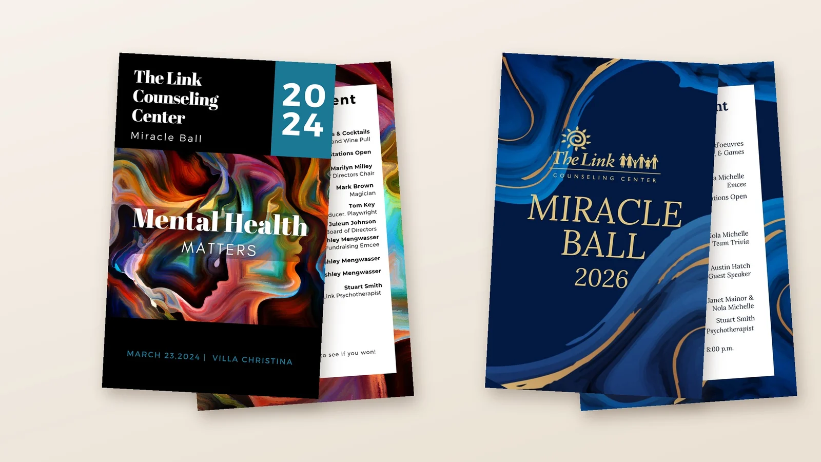
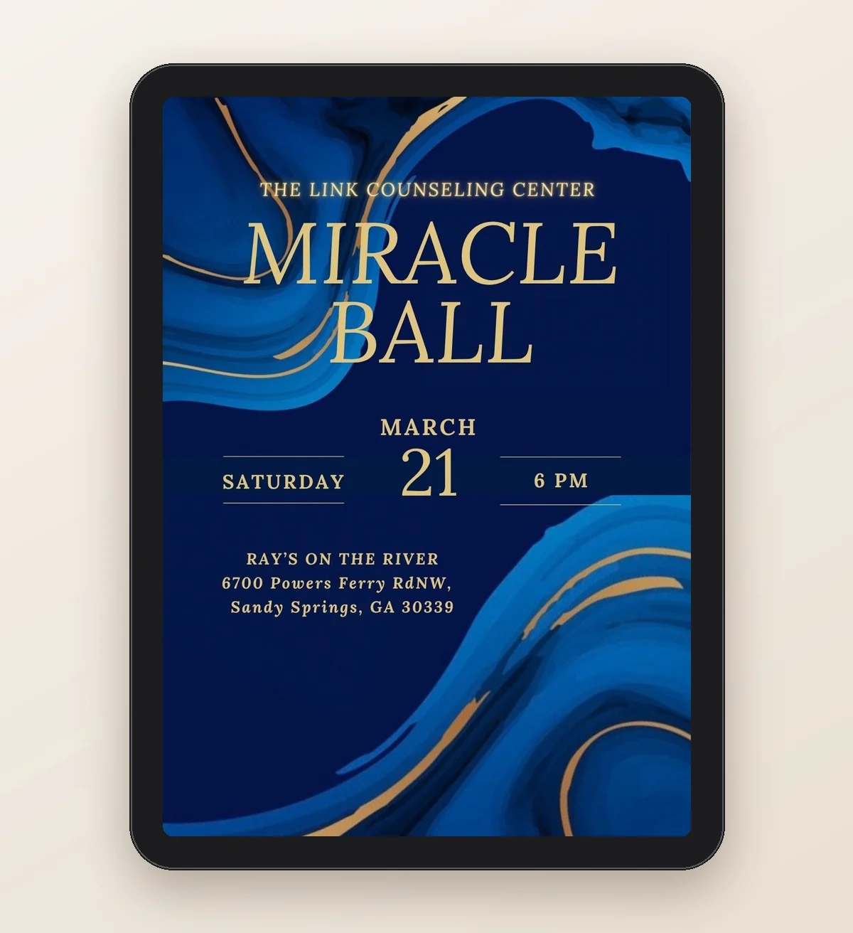
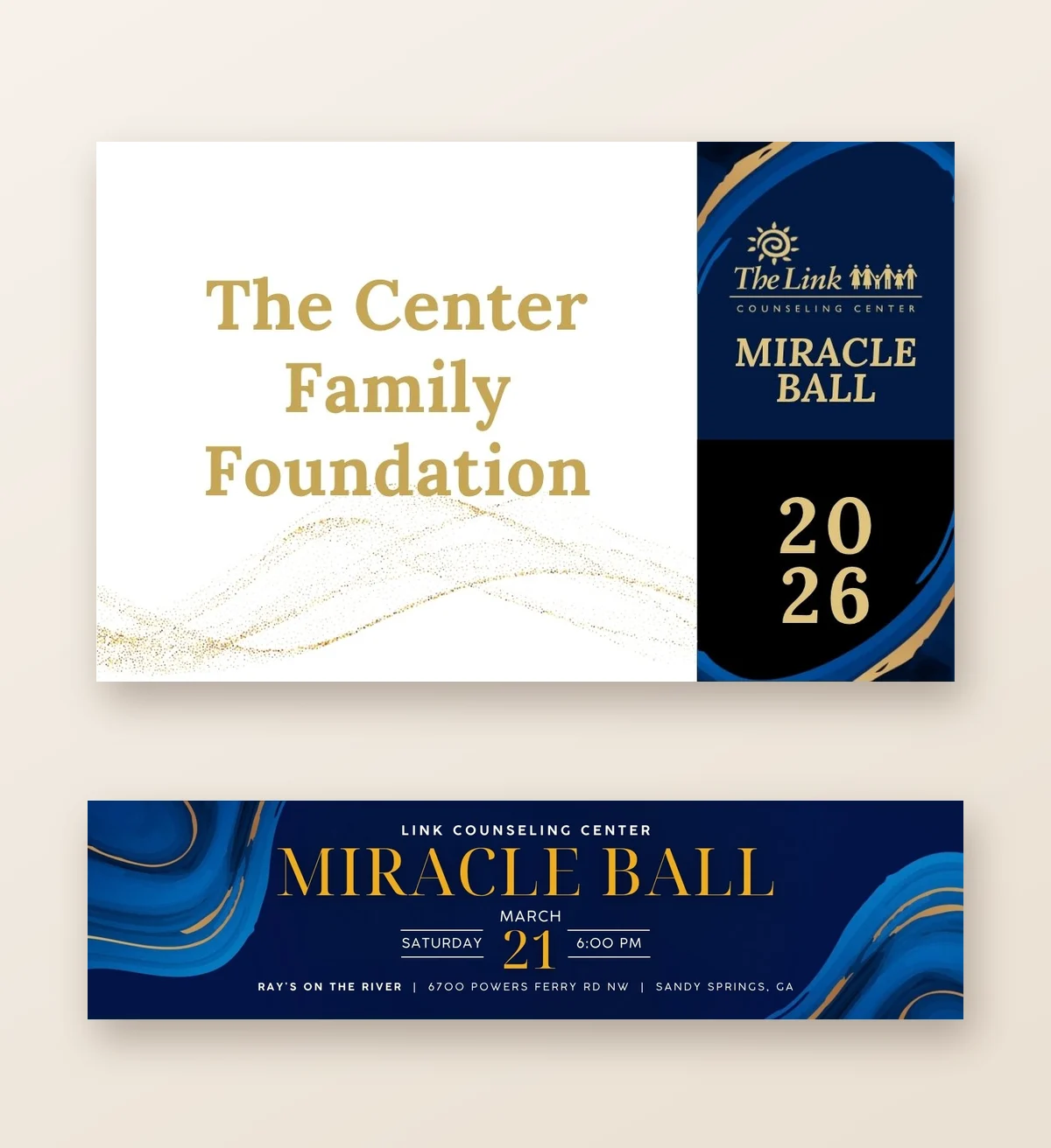
02 The Miracle Ball
Designing for a cause.
Client: The Link Counseling Center · Collaboration: Park Avenue Events · Scope: Gala Programs, Event Signage, Auction Materials & Event Communications
The Miracle Ball is an annual fundraising gala benefiting The Link Counseling Center, an organization dedicated to making mental health services accessible to individuals and families.
Through my ongoing collaboration with Hester Parks of Park Avenue Events, I’ve provided creative design support for the gala across multiple years. From event programs and promotional banners to auction materials and guest communications, each piece is designed to bring the event together visually while supporting its fundraising purpose.
The work balances an elegant gala experience with clear, functional communication—helping guests navigate the evening, engage with fundraising opportunities, and connect with the mission behind the celebration.
The same mission, a new look each year: Miracle Ball programs, 2024 and 2026Miracle Ball 2026 invitationSponsor table tent and event banner, 2026
03 Supporting the Business
The work behind the work.
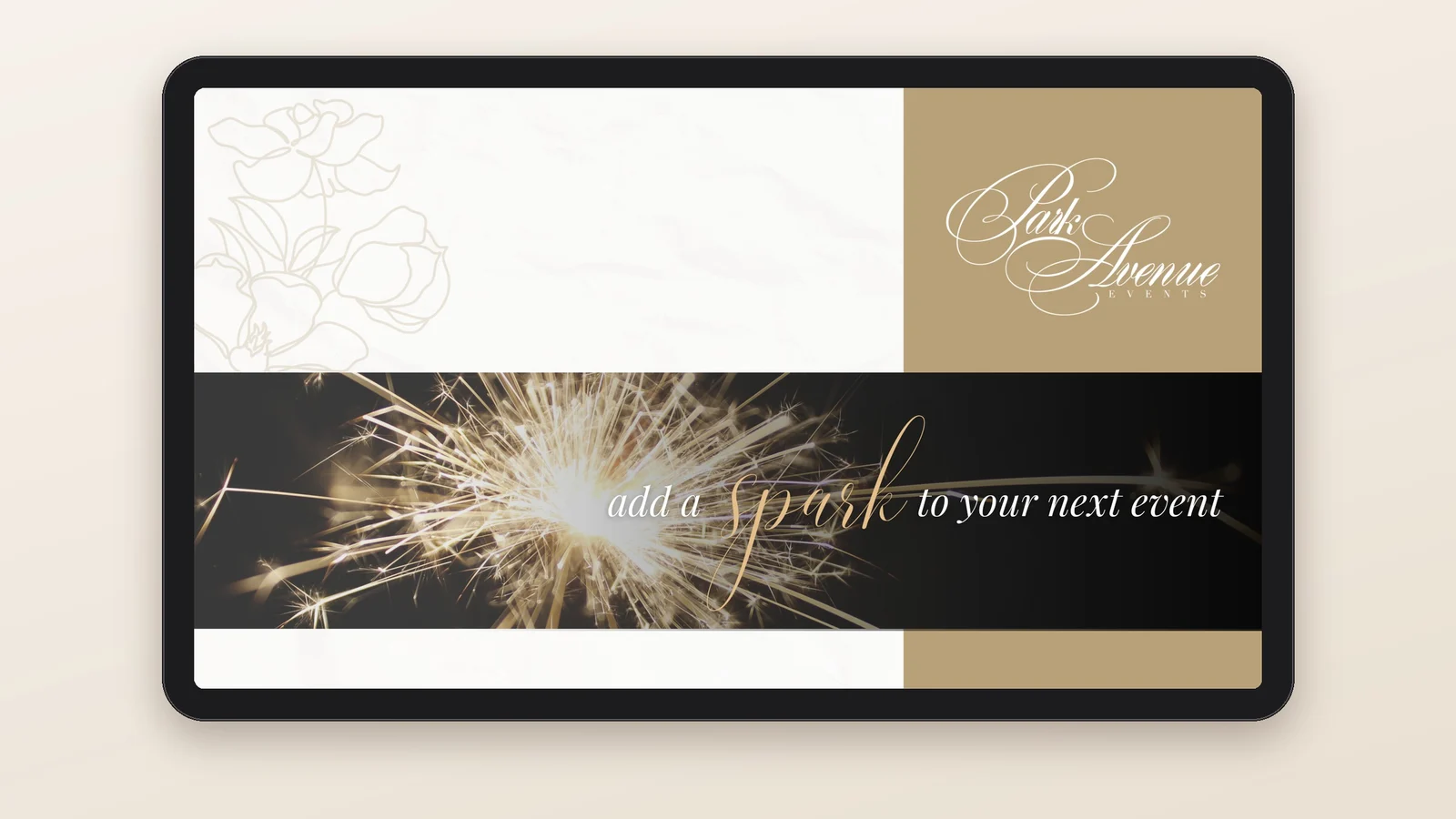
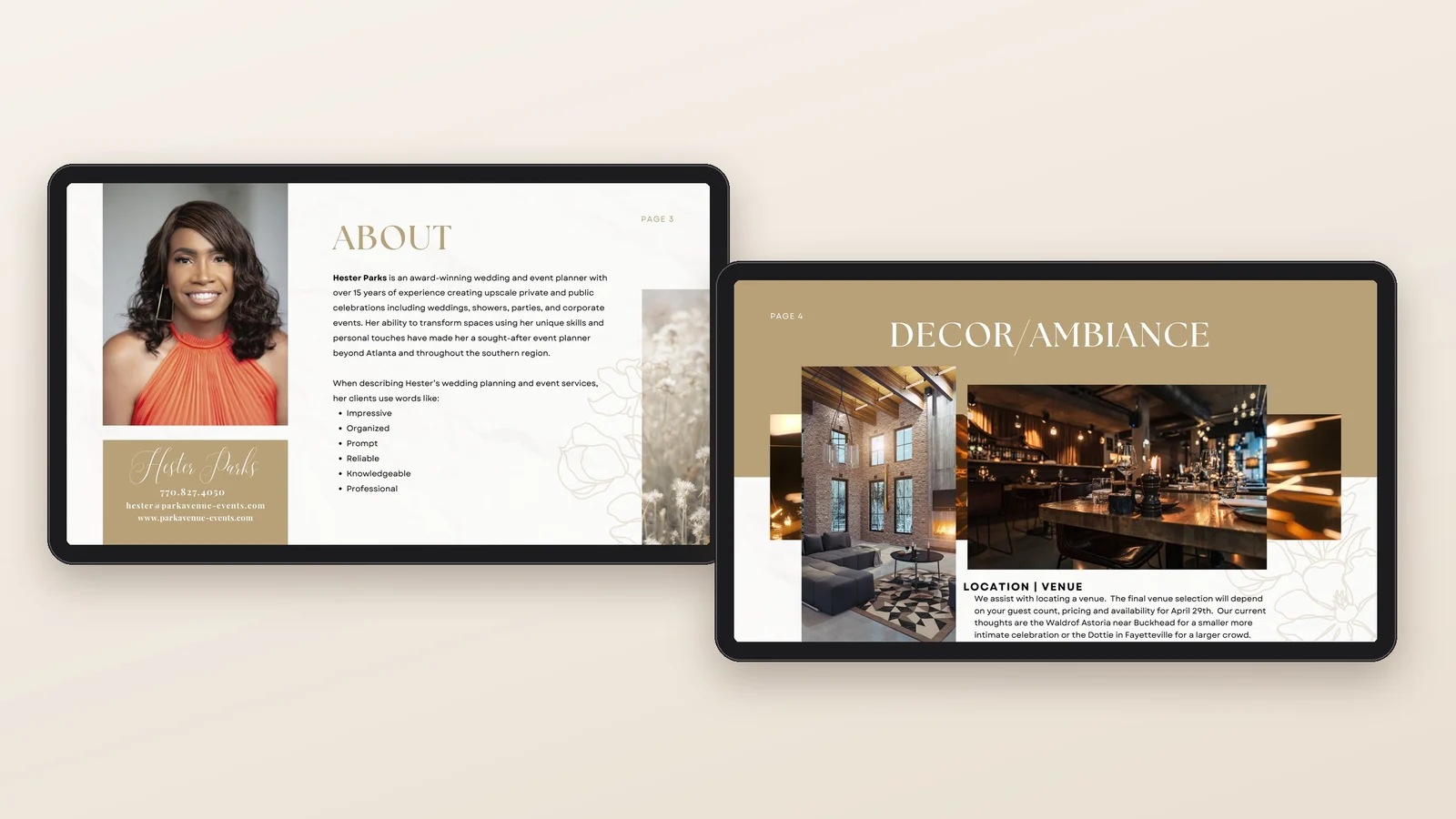
Before an event is booked, a client has to believe in it. I design proposals in the Park Avenue brand that walk a client through the vision, from the planner’s story to venue, décor, and the details that make it personal, along with event management proposals for organizations and the brand communications that keep the business visible.
A Park Avenue proposal: “add a spark to your next event”Inside the proposal: the planner and the vision
05 The Impact
The strength of this work is range inside a long partnership: a new design approach for every client, and the same trusted collaborator since 2017.
No two invitations look alike, because no two guests of honor are alike. Each one tells guests what kind of celebration to expect before they arrive, and every proposal helps Hester’s clients see the event before it happens.
Completed through Nina Simmons Designs, Inc. Digital invitations and proposals are shown in mockups created for this portfolio. The Bobby DeBarge Story key art courtesy of TV One.
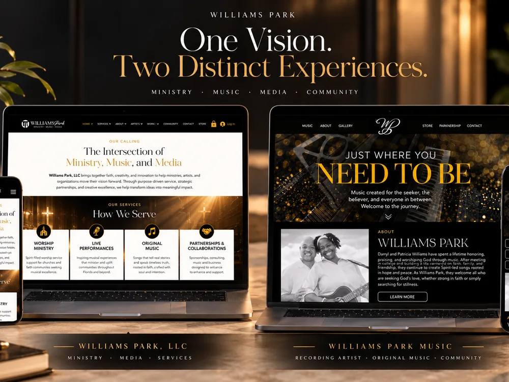
Williams Park:Two distinct brands. One shared vision.
Williams Park is the music ministry of husband-and-wife duo Darryl and Patricia Williams, supported by Williams Park, LLC, the business behind their music, media, and creative ventures.
Brand identity film, 0:37. Edited by me with an original soundtrack.
Music only, no narration. On screen: the WP monogram and Williams Park, with the line One vision. Two connected experiences. Both websites: Just where you need to be, and Moving Ministries Forward. A photo of Darryl and Patricia Williams with a guitar: 35 years together, 25+ years as Ministers of Music. The brand architecture board builds piece by piece. Quick cuts of the websites, the God Cares lyric section, and the services. A close-up of the couple: Music that takes you where you need to be. The magazine ad and postcard. The closing shows both logos with Rooted in faith. Guided by purpose. Brand identity and creative direction by Nina Simmons.
02 Project Overview
Client
Williams Park
Industry
Media, music & ministry
Engagement
Fractional brand & marketing lead, January 2026 to present
Scope
Creative Direction · Brand Strategy · Integrated Brand Experience
Creative Leadership
Directed brand architecture, messaging, digital experiences, and integrated creative development across Williams Park’s music ministry and business entities, including two distinct websites.
Impact
Established clearer differentiation between the two entities and a more connected digital presence supporting music releases, merchandise, audience engagement, and future growth.
03 The Challenge
Williams Park was evolving beyond its foundation in music and ministry.
Darryl and Patricia Williams had built a legacy of faith, music, and service. As their vision expanded into media, technology, artist support, merchandise, and business partnerships, they needed a clearer way to communicate the different parts of their organization.
The challenge was to establish two distinct brand experiences while preserving the connection to the founders and their shared mission.
I designed the original Williams Park logo years ago. When Darryl and Patricia retired and could invest fully in their brands, they came back to me, and I have served as their creative counsel since January 2026.
04 The Creative Direction
Building clarity across a growing brand ecosystem.
My role extended beyond visual design into brand architecture, messaging, marketing direction, and the development of connected experiences.
I helped define how Williams Park Music and Williams Park, LLC would communicate their individual purposes while operating under one recognizable brand family.
That direction informed the websites, visual identities, content, campaigns, and audience touchpoints that followed.
05 The Work
01 Brand Architecture
One vision. Two distinct identities.
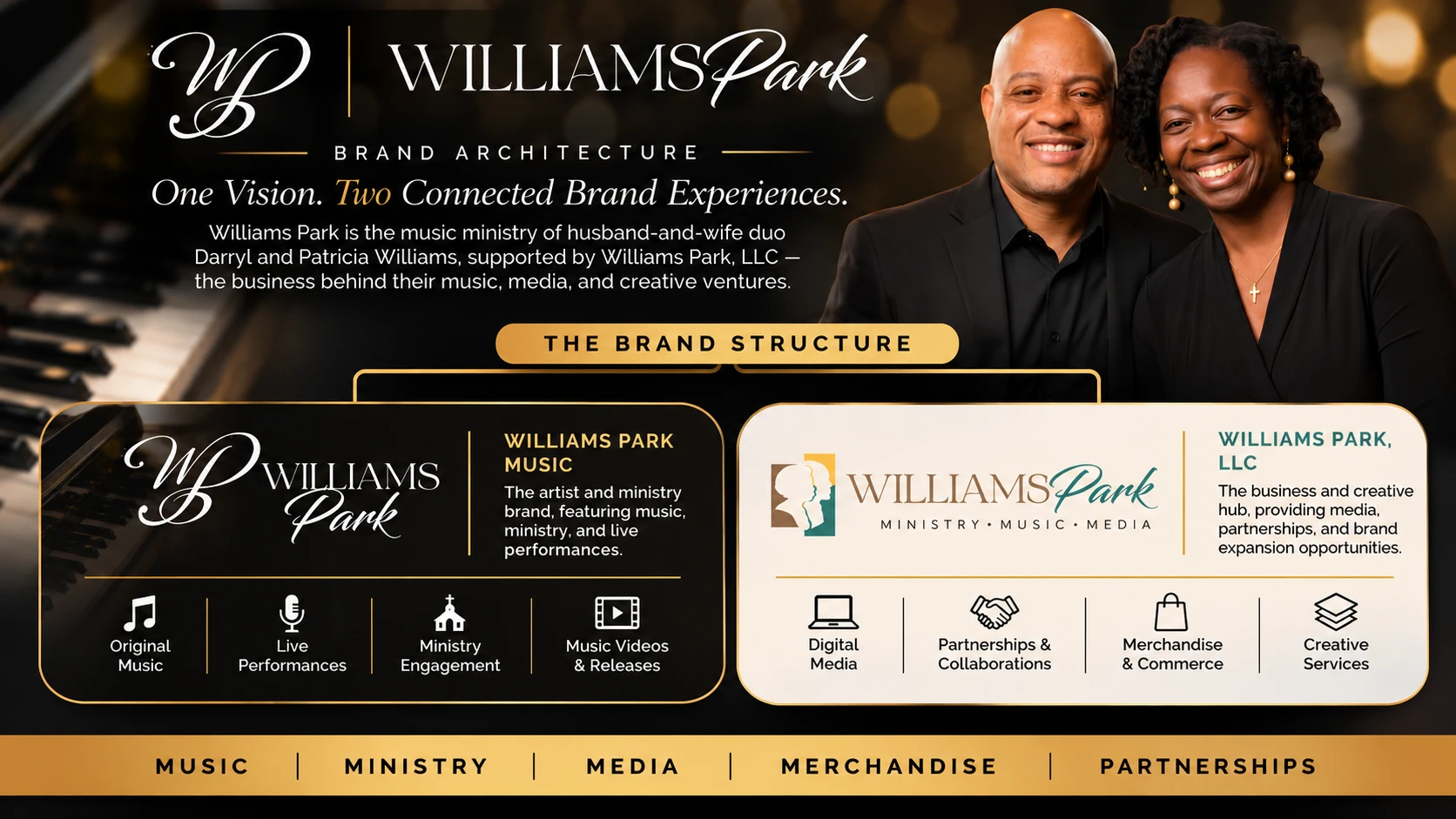
Williams Park Music represents the artists, their music, performances, and ministry. Williams Park, LLC is the business structure behind media, technology, creative ventures, and partnerships.
The architecture gives each a clear purpose while keeping the broader Williams Park experience connected.
Brand architecture board I designed: one name, two connected experiences
02 Digital Experience
Two websites. Two different journeys.
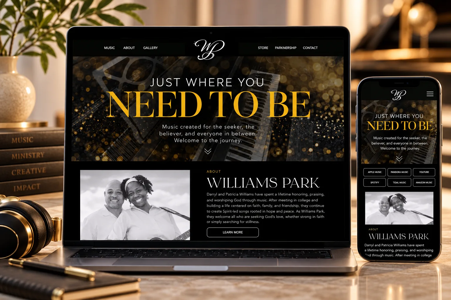
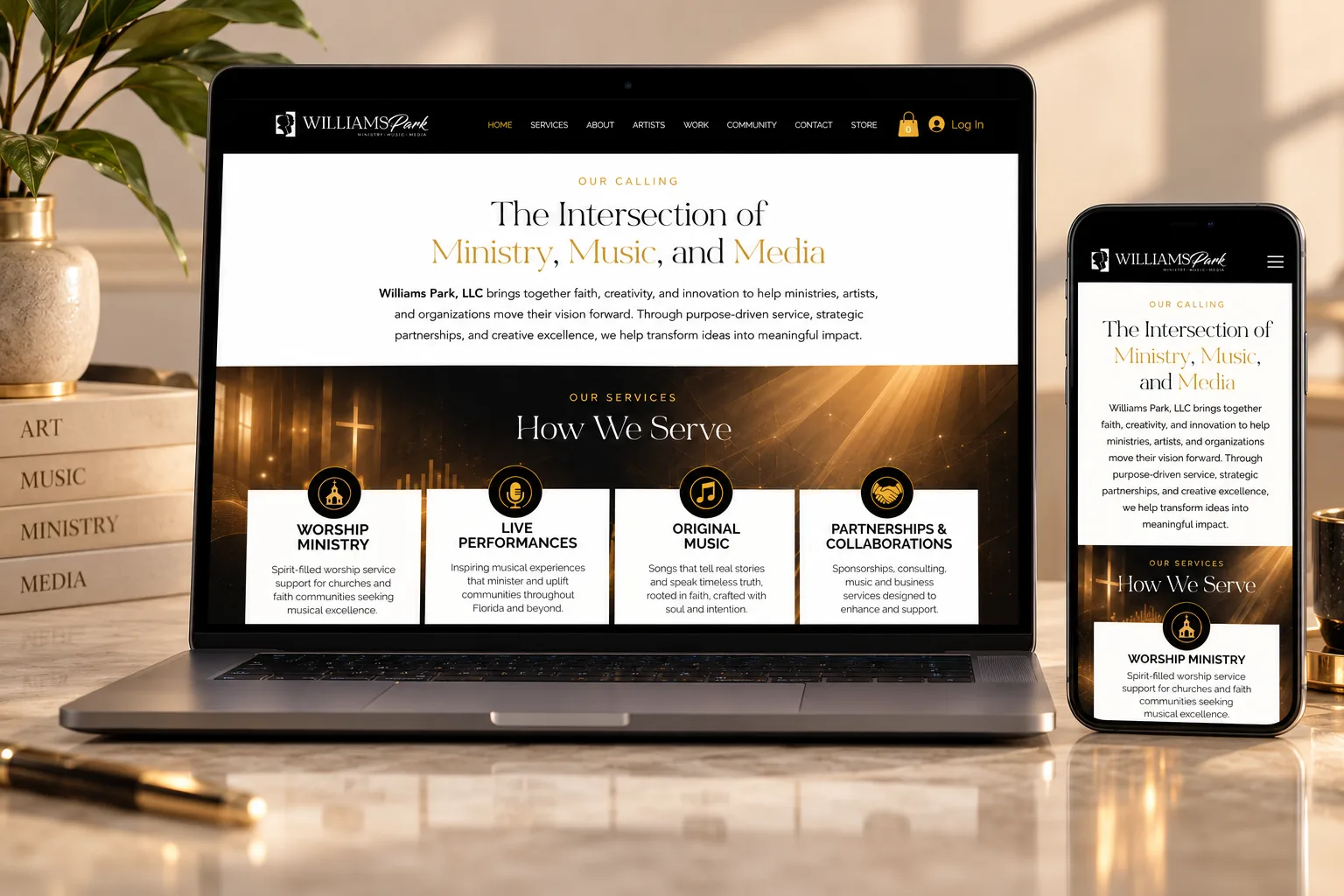
The Williams Park Music site centers on the artists, their story, and their ministry. The Williams Park, LLC site communicates the broader business vision and its growing services. Each was directed around its own audience, with distinct content priorities and navigation.
Williams Park Music: the recording artist and ministryWilliams Park: the media, technology, and artist-management business
03 Music & Visual Storytelling
Extending the message beyond the performance.
Creative direction included visual storytelling and promotional content supporting Williams Park’s music and ministry.
Projects such as the God Cares lyric video, with Joy to the World releasing in November 2026, demonstrate how the brand’s message extends into digital media, creating additional ways for audiences to engage with the music.
God Cares, official lyric video. Directed by me, filmed by a hired videographer.
Marriage Talk: The Power of Teamwork in Marriage. Directed and created by me.
04 Community & Content
Creating reasons to stay connected.
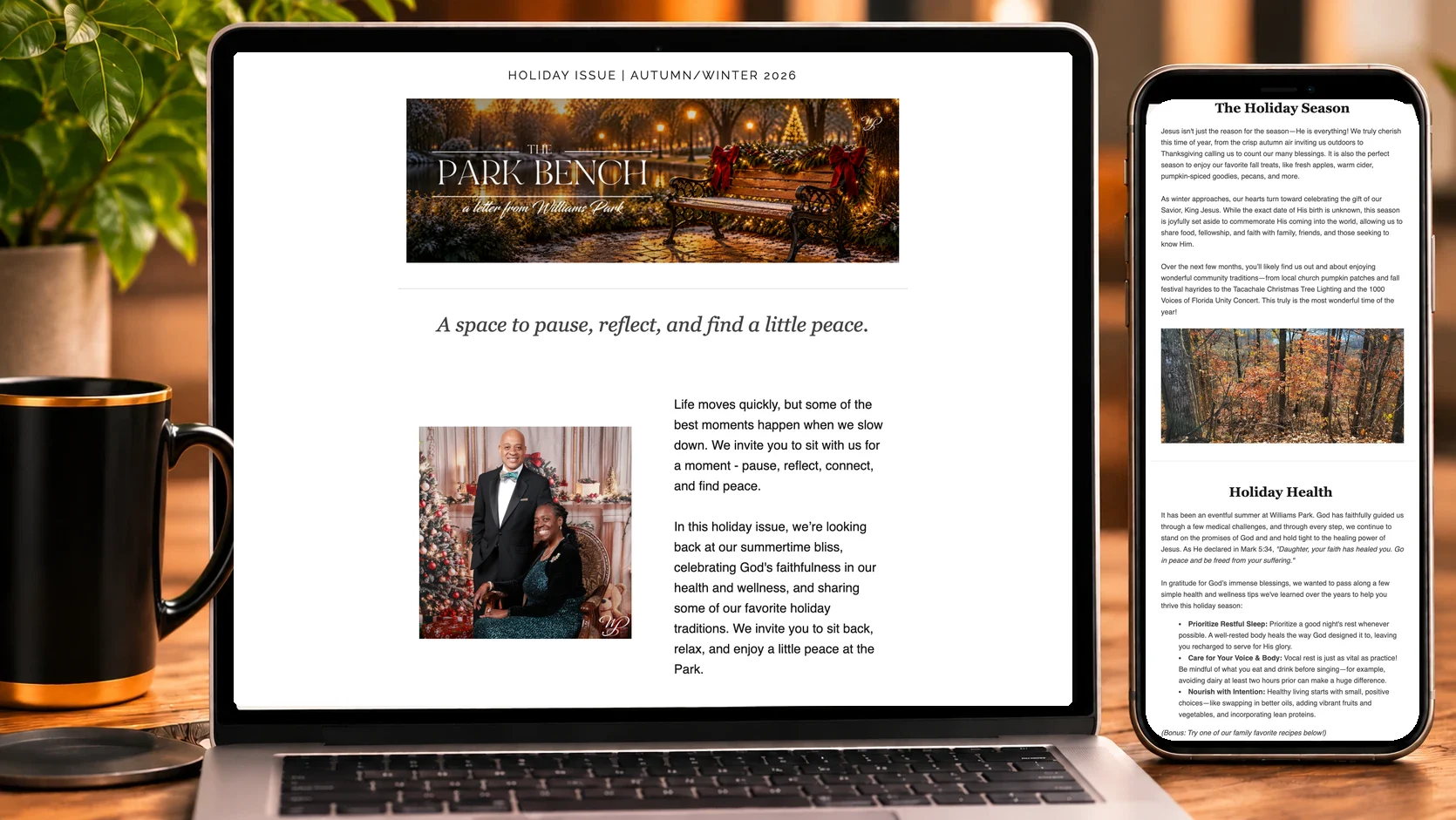
The brand experience continues through social media, promotional campaigns, and The Park Bench, Williams Park’s semiannual newsletter.
The newsletter brings together personal reflections, ministry updates, wellness, recipes, and community news in an editorial experience that reflects the warmth and personality of the founders.
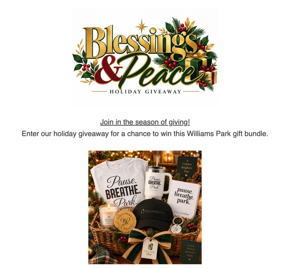
WP Check-in: Holy Forever, Isaiah 6:3, a YouTube ShortBlessings & Peace holiday giveaway with the Pause. Breathe. Park. gift bundleThe Park Bench newsletter, holiday issue, on desktop and mobile
05 Print & Promotional Design
A consistent identity across physical and digital touchpoints.
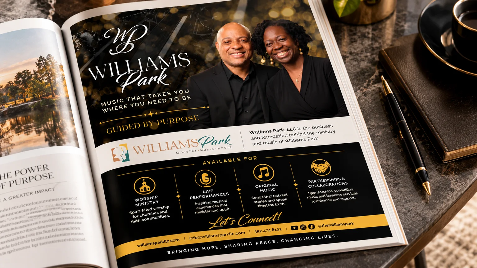
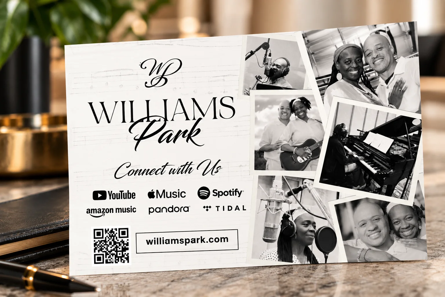
Print advertising, postcards, and promotional materials extend the brand into community outreach, events, and marketing communications.
Each execution supports a recognizable presentation while serving a specific communication purpose.
Full-page print adPostcard flyer for churches
06 The Lifestyle Collection
Pause. Breathe. Park.
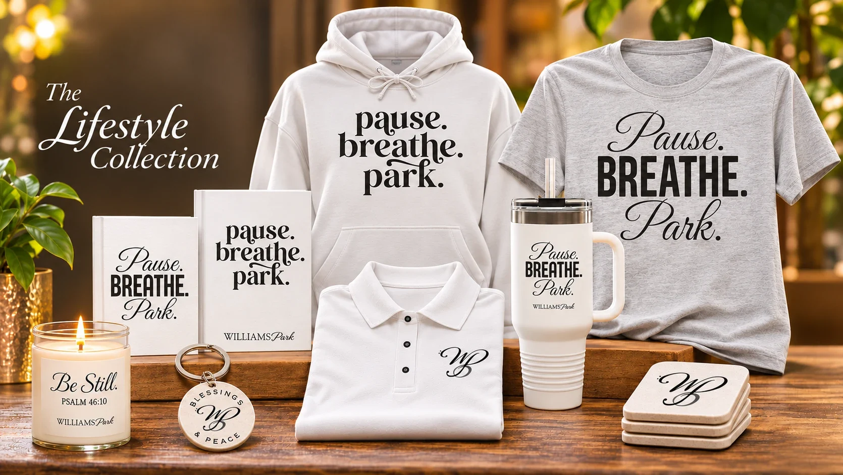
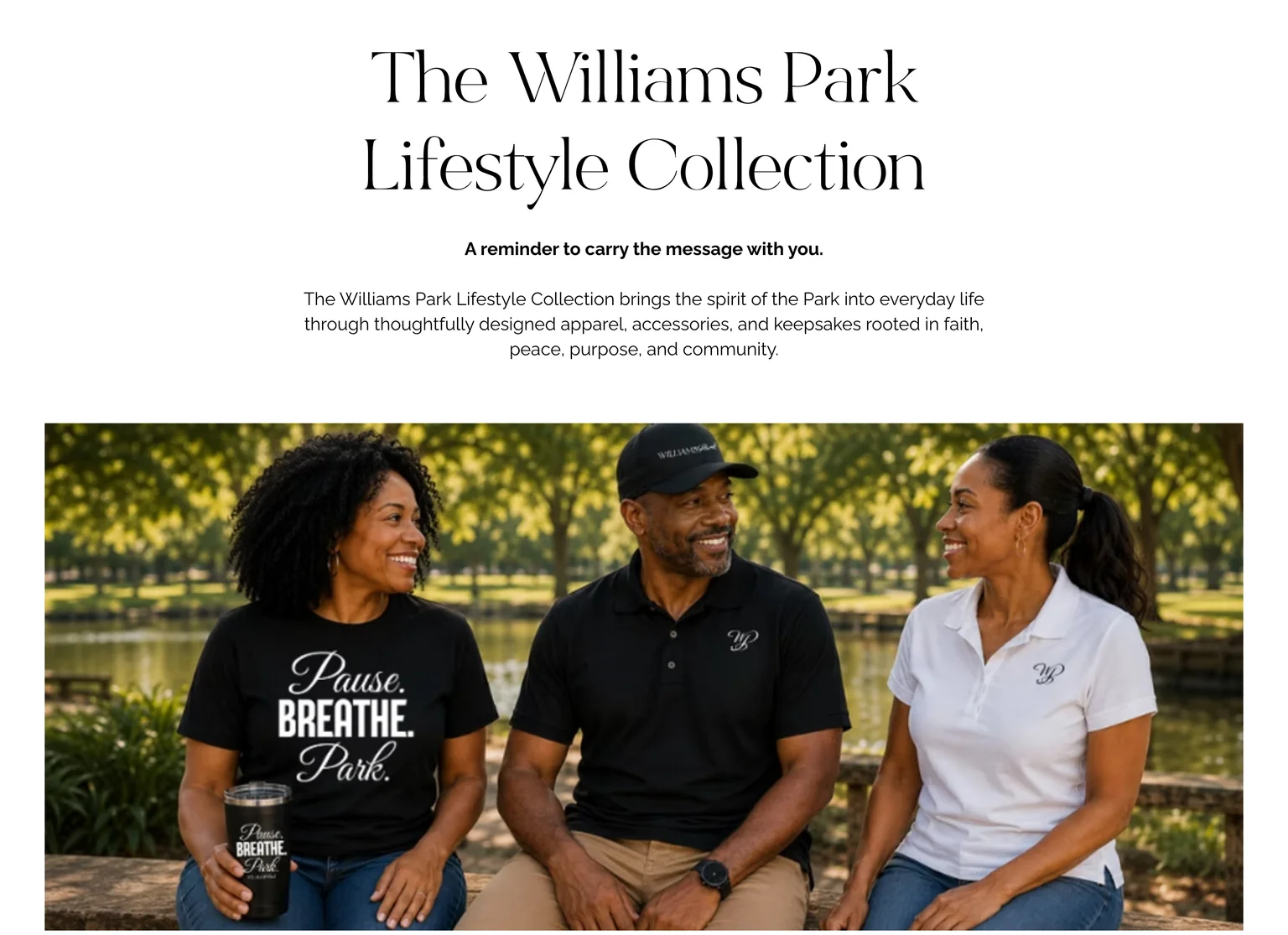
The Williams Park Lifestyle Collection translates the spirit of the brand into everyday products.
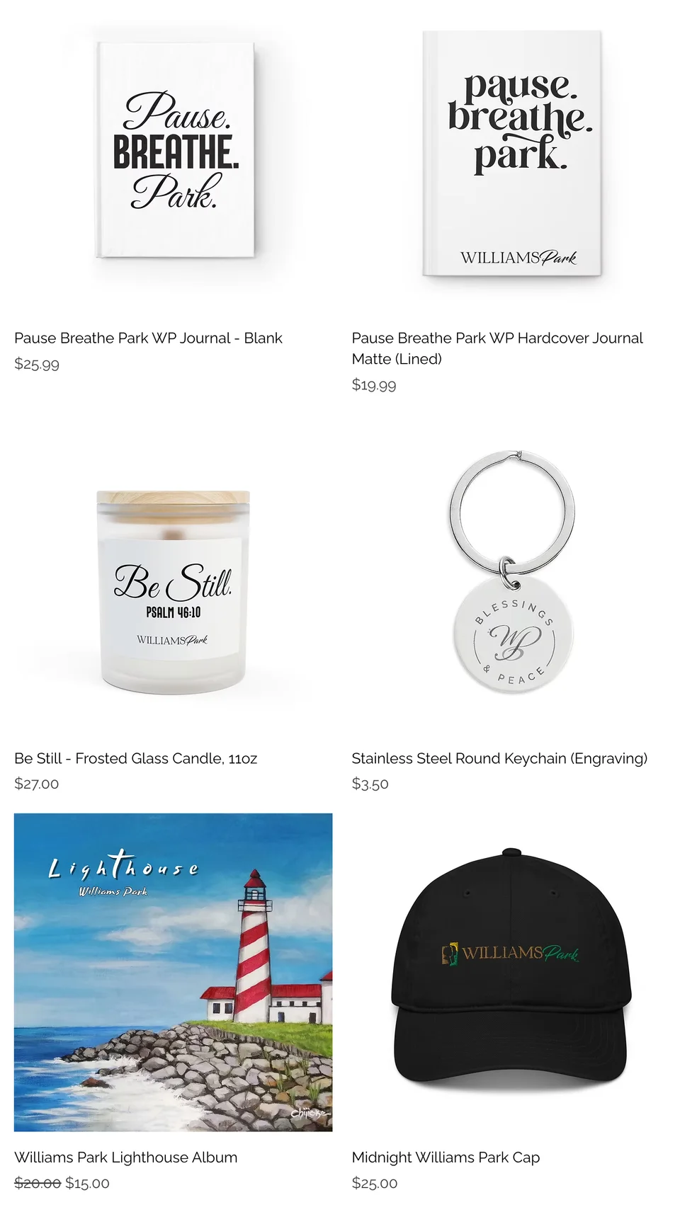
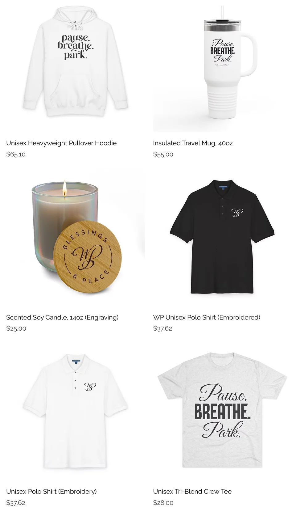
Through apparel, journals, drinkware, candles, and accessories, the collection extends the brand’s message of peace, reflection, and intentional living beyond its music and ministry.
Distinct typographic treatments, the WP emblem, and thoughtfully selected messages create a cohesive collection that feels connected to the broader Williams Park identity.
The Lifestyle CollectionThe collection’s store page on williamsparkllc.comJournals, candle, keychain, album, and capHoodie, travel mug, candle, polos, and tee
06 The Outcome
From separate initiatives to a connected brand experience.
The work established a clearer distinction between Williams Park’s artistic and business identities while creating a consistent direction across digital, print, video, editorial, and merchandise experiences.
Together, these elements provide a foundation for continued brand development and audience engagement.
The result is more than a collection of creative deliverables. It’s a connected brand ecosystem built to support an expanding vision.
All work shown was created under my art and creative direction.
Lifestyles of Luxury & Swing Into Their Dreams:One creative partner, two missions.
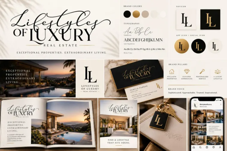
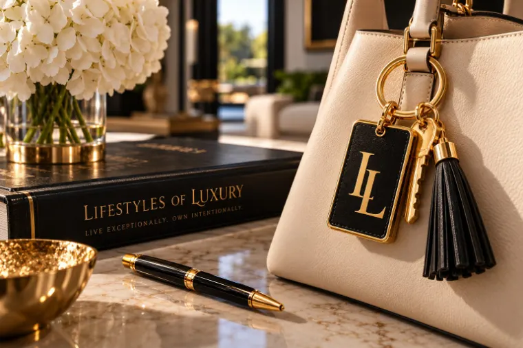
For luxury real estate broker Pamela Parker, I lead the creative on two fronts: the brand and editorial marketing for Lifestyles of Luxury Real Estate, and the branding and creative marketing for Swing Into Their Dreams, the nonprofit foundation she co-founded.
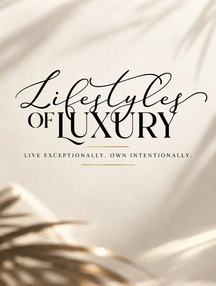
Lifestyles of Luxury brand logo animation
02 Project Overview
Client
Pamela Parker: Lifestyles of Luxury Real Estate · Swing Into Their Dreams Foundation
Roles
Creative Director & Brand Strategist · Creative Marketing Director
How the two organizations in this partnership compare
Lifestyles of Luxury
Swing Into Their Dreams
Organization
Luxury real estate brand
Nonprofit foundation
My role
Creative Director & Brand Strategist
Creative Marketing Director
Focus
Brand identity and editorial marketing
Branding, marketing, and content
Audience
Affluent homeowners and clients
Community, supporters, and partners
Positioning
Brand positioning
Mission-driven communications
Lifestyles of Luxury
Creative Leadership
Lead brand development and creative direction for luxury real estate broker Pamela Parker, overseeing visual identity, editorial branding, and marketing communications. Directed a promotional video in collaboration with a professional videographer, extending the brand’s creative vision into video storytelling.
Impact
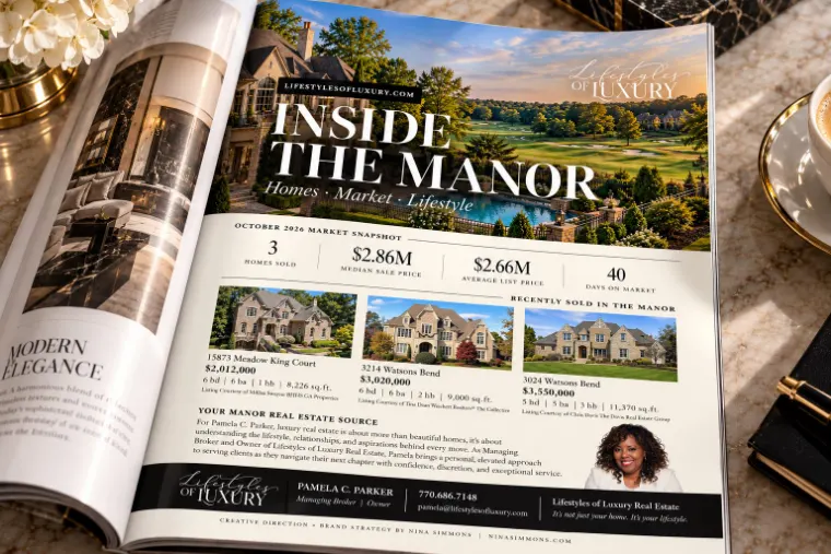
Established a refined and cohesive brand identity across print, digital, and promotional content, creating a consistent visual foundation for Inside the Manor and marketing initiatives targeting the luxury real estate audience.
Swing Into Their Dreams
Creative Leadership
Lead branding and creative marketing for Swing Into Their Dreams Foundation, collaborating directly with co-founder Pamela Parker and a videographer to develop visual communications, marketing materials, and content that support the foundation’s mission and initiatives.
Impact
Developed a more coordinated visual and marketing presence across brand communications and content, supporting the foundation’s ability to communicate its mission, promote initiatives, and engage prospective supporters and partners.
03 The Challenge
Refresh an established luxury brand without losing what made it credible. The new identity had to feel more distinctive and polished, keep Pamela’s personal character, and stay recognizable across recurring publication placements.
Lifestyles of Luxury brand identity board
04 The Strategic Response
I paired a refined identity with approachable messaging, so the brand reads as luxury without feeling distant. I extended the direction into publication layouts and created the “Inside the Manor” editorial concept, giving recurring ads a consistent format that builds recognition over time.
My role
I led the refresh from start to finish: setting the visual direction, designing the logo, and establishing the standards. I continue as creative director for the brand’s editorial print advertising and ongoing marketing.
05 The Work
Identity
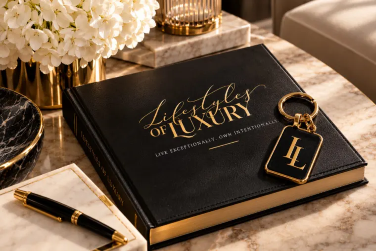
A script-and-serif logo and an LL monogram, built to read as luxury without feeling distant.
Lifestyles of Luxury logo lockupLifestyles of Luxury monogram
Editorial print
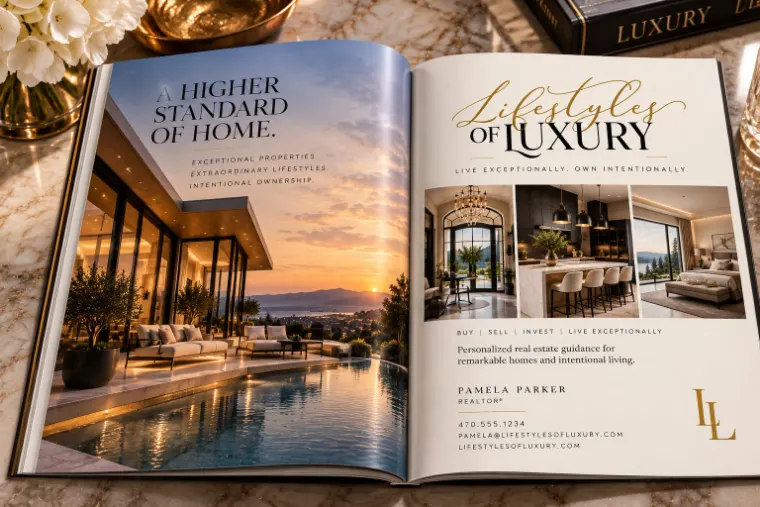
Recurring magazine placements that carry one identity to an affluent residential audience.
Inside the Manor magazine feature, October 2026A Higher Standard of Home magazine spread
Brand touchpoints
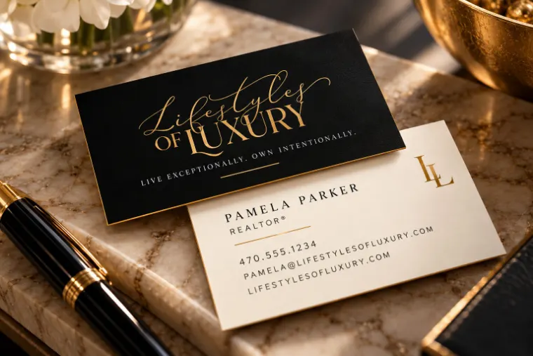
The identity in hand: key tag, brand journal, and business cards.
Lifestyles of Luxury brand stylingLifestyles of Luxury brand journalLifestyles of Luxury business card
Promotional video
I directed the creative for the brand’s promotional video and hired the videographer, carrying the identity and its promise, “not just your home, your lifestyle,” into motion.
Lifestyles of Luxury promotional video. Creative direction by me, filmed by a videographer I hired.
Swing Into Their Dreams
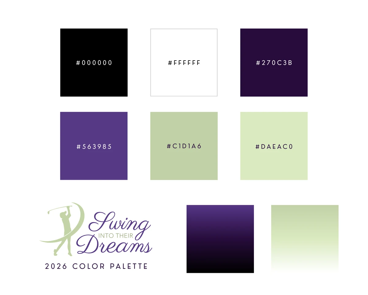
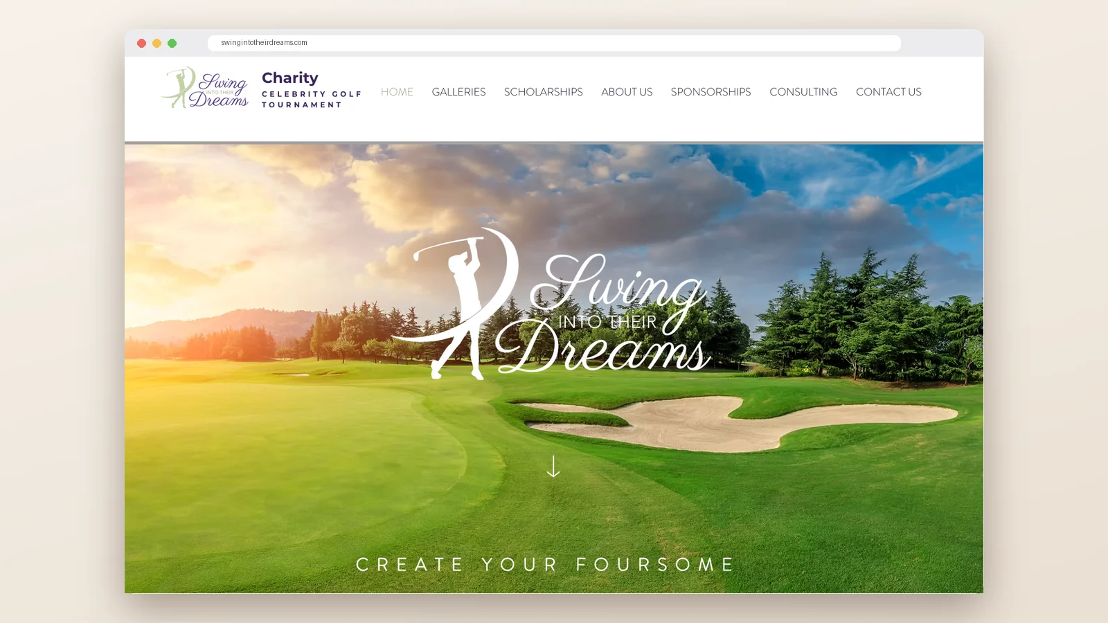
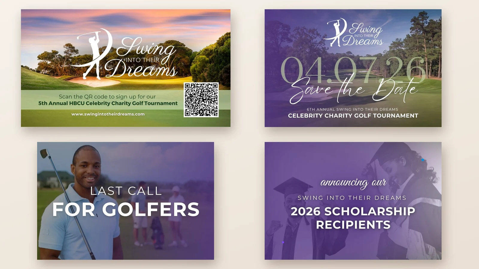
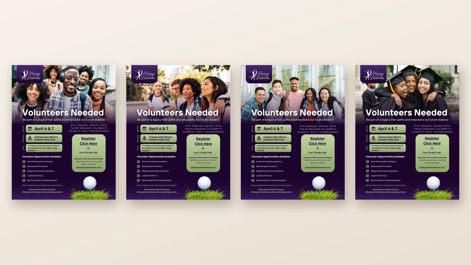
For the foundation, the same partnership shifts from luxury to mission. Swing Into Their Dreams hosts a celebrity charity golf tournament that raises scholarships for students at historically Black colleges and universities. I designed the foundation’s logo and website, all of the signage for its most recent tournament, and the ads and promotions around it, carrying one purple-and-sage brand to students, families, golfers, sponsors, and supporters.
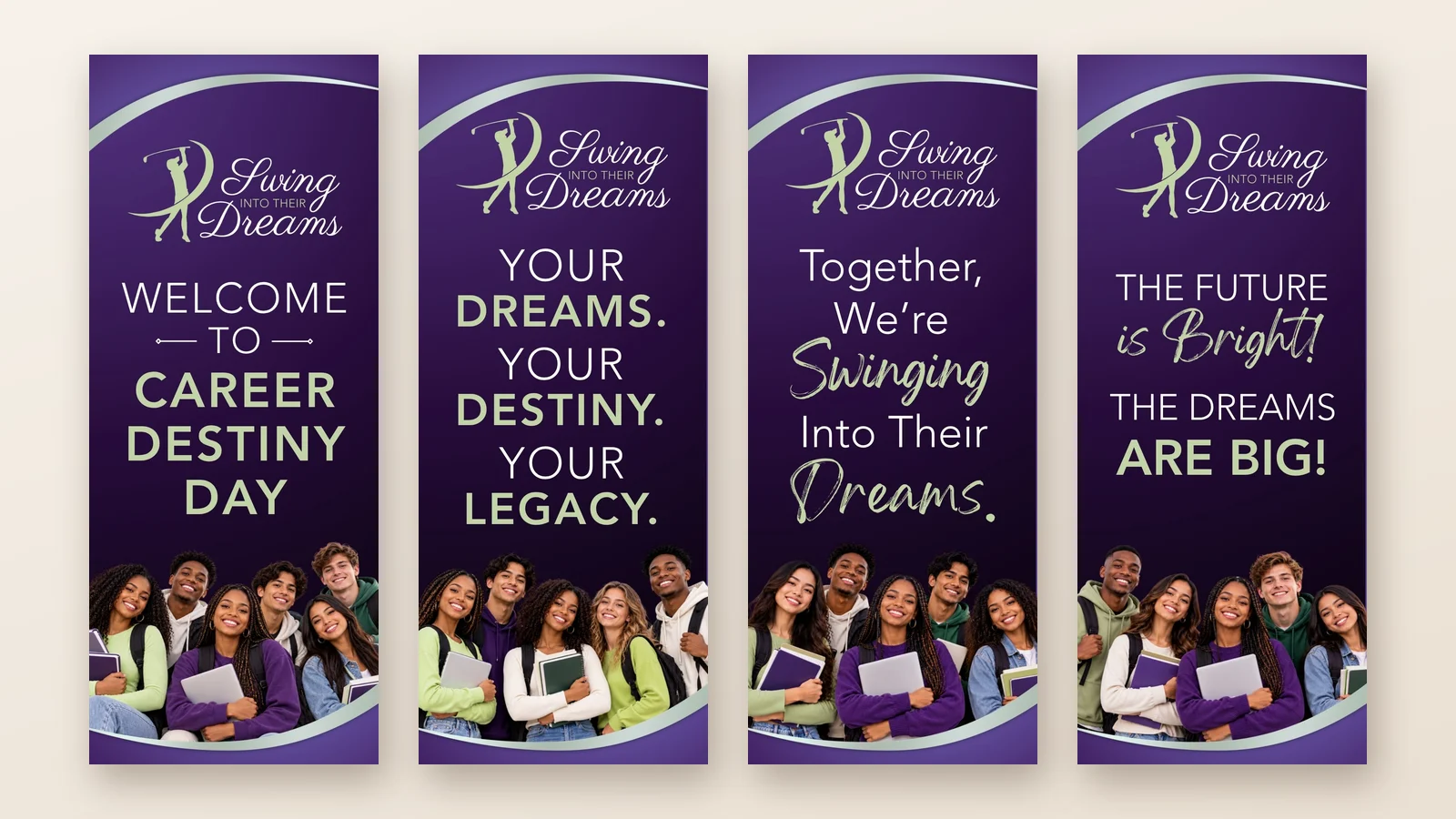
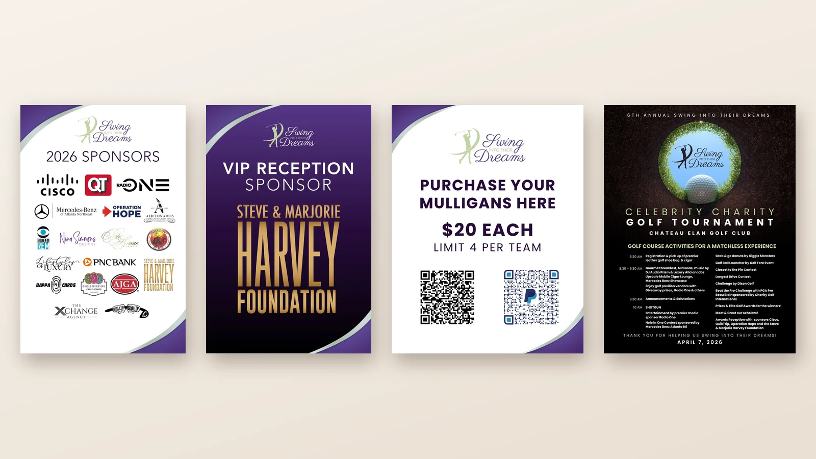
The 2026 brand paletteStep-and-repeat backdropThe foundation’s logo and website2026 tournament signage: the retractable banner seriesSponsor recognition, fundraising, and course signageAds and promotions: TV spot, save-the-date, last call, and scholarship announcementVolunteer recruitment: one flyer system, four audiences
06 The Impact
The refresh gave the brand a new logo and a cohesive visual foundation that now runs across its ongoing marketing. Each recurring placement reinforces the same identity, giving Pamela a consistent, recognizable presence in the publications serving her audience. Alongside it, the foundation gained a coordinated presence for its mission work, showing the same creative partnership serving both a commercial brand and a nonprofit.
YE Foundation:There’s more to the garden than what you can see.
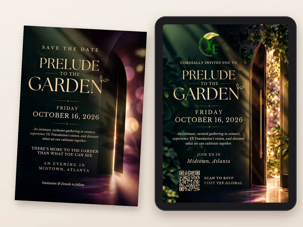
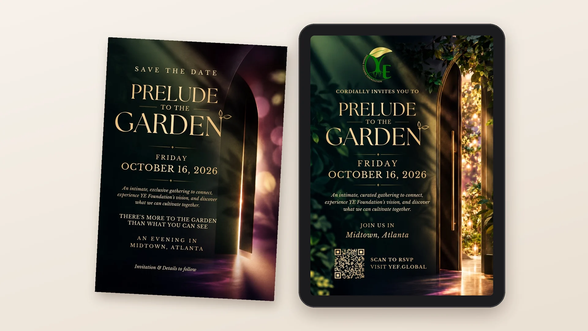
Prelude to the Garden was an intimate evening in Midtown Atlanta that invited guests into YE Foundation’s vision. I led the creative direction for the evening, shaping the visual world from the first save-the-date to the passport, menus, and signage guests found in the room.
The save-the-date and the invitation: a door left slightly open
02 Project Overview
Client
YE Foundation
Event
Prelude to the Garden, October 16, 2026, Midtown Atlanta
Role
Creative Director & Visual Identity Chair · Board Member
Serve on YE Foundation’s Board of Directors as Creative Director and Visual Identity Chair, providing creative direction and visual identity oversight. Led the development of integrated event communications for Prelude to the Garden, including invitations, presentations, sponsor recognition, signage, and interactive guest materials.
Impact
Created a cohesive visual experience connecting YE Foundation’s mission, fundraising initiatives, and community engagement. Developed communications and interactive materials that helped guests explore the foundation’s programs, understand partnership opportunities, and participate in the event’s fundraising activities.
03 The Challenge
YE Foundation’s mission is big: transforming waste into renewable energy and better living conditions in underserved communities. Prelude to the Garden had to introduce that mission in a single, intimate evening, and turn a room of guests into supporters.
04 The Creative Direction
A garden as a promise of growth.
The garden became the metaphor for what the foundation cultivates. I built the world on deep green, gold, and burgundy peonies, with a door left slightly open to suggest there was more to discover. Every piece carried the language of growth: roots, blooms, and cultivation.
I worked alongside the décor and silent auction teams and the venue, which handled the food, so the creative direction and the experience in the room told the same story.
05 The Work
01 Setting the Mood
Direction before design.
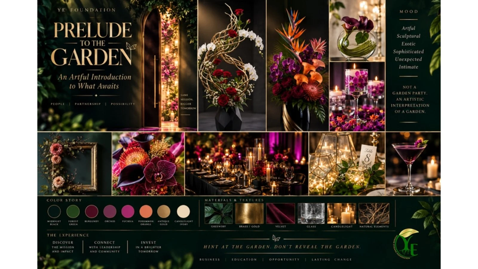
The moodboard set the palette, textures, florals, and light before a single piece was designed, so the invitation, presentation, and room would feel like one world.
The moodboard
02 The Story on Screen
Why we’re gathering.
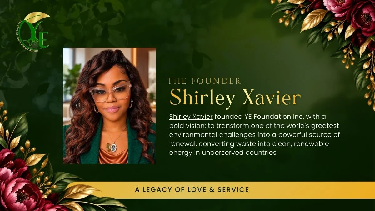
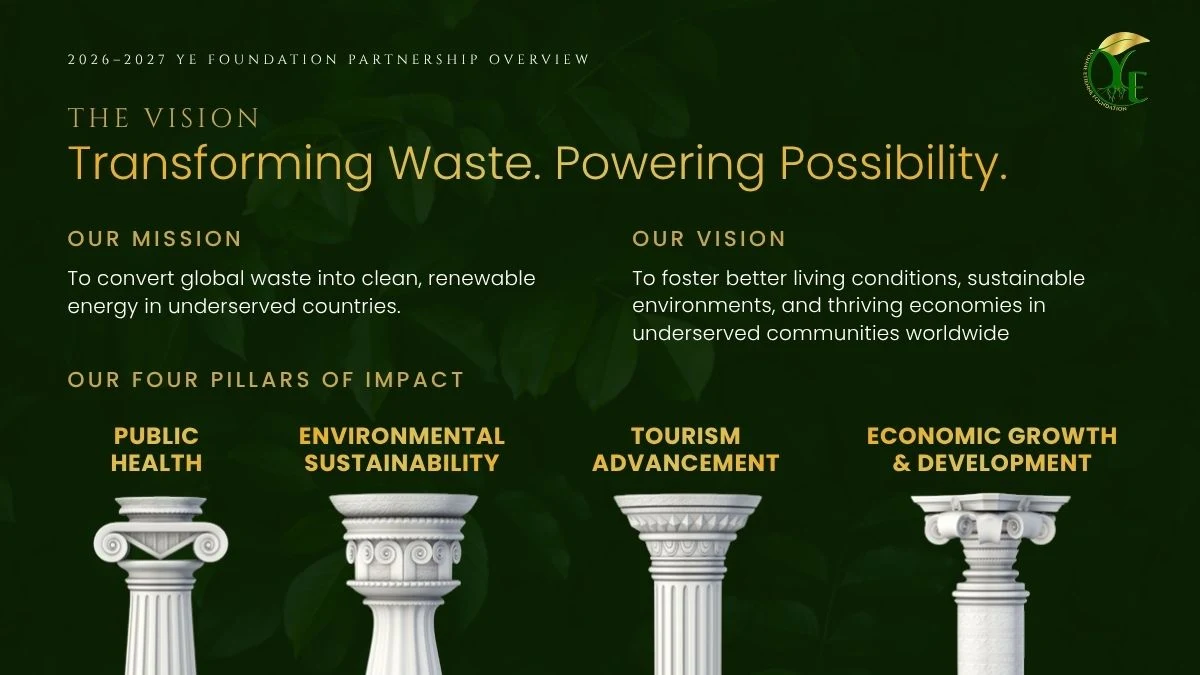
A presentation carried the program, introducing founder Shirley Xavier, the legacy of her mother, Yvonne Etienne, and the foundation’s vision and four pillars of impact.
The founderThe vision and four pillars
03 In the Room
Turning interest into action.
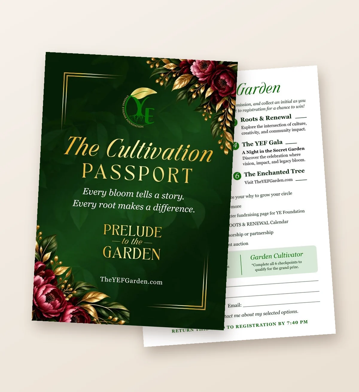
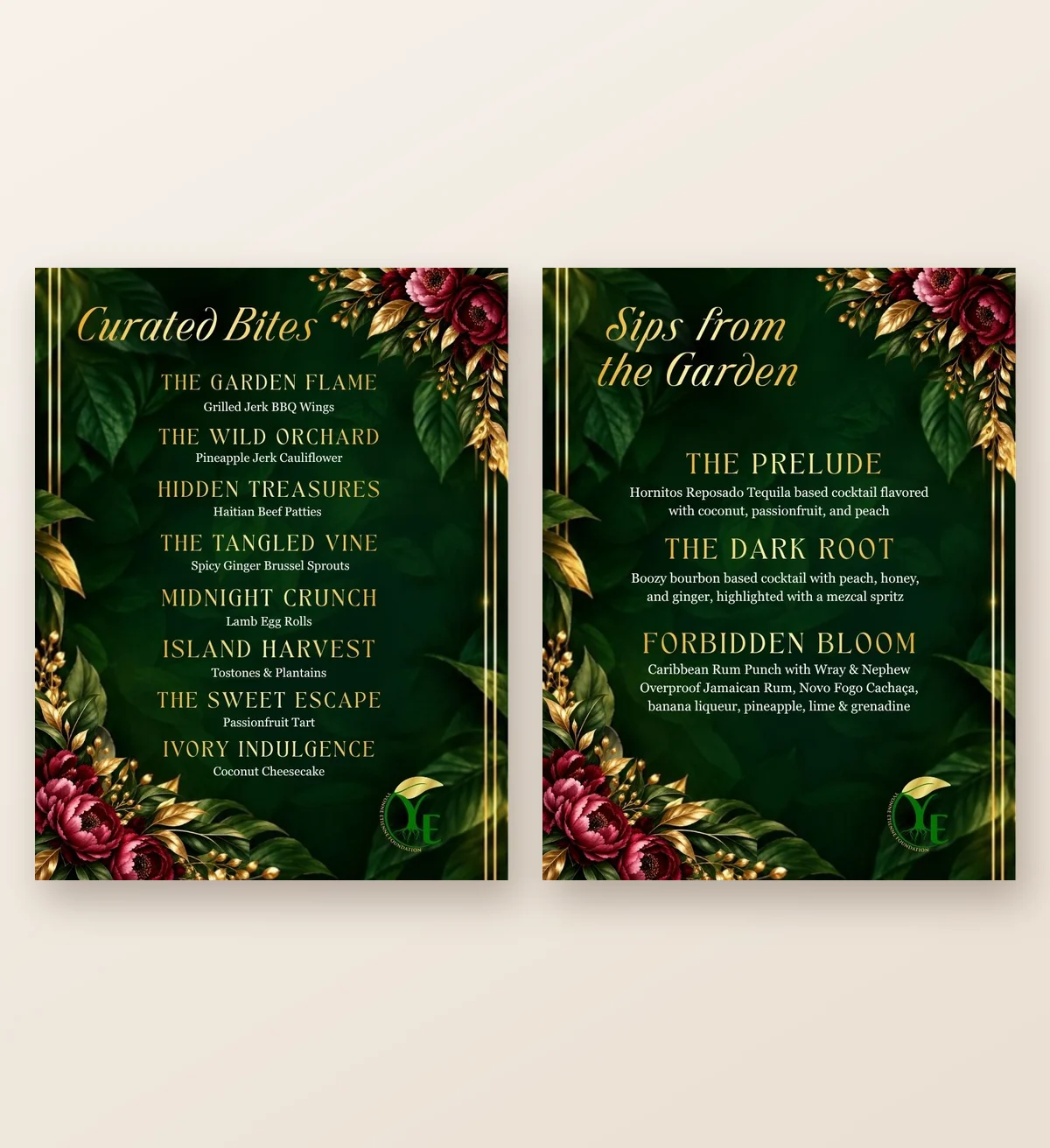
The Cultivation Passport gave guests a reason to explore: six checkpoints across the evening, from learning about the foundation’s initiatives to choosing how they wanted to get involved. Menu and cocktail signs named every dish and drink in the garden’s language, carrying the story to every table.
The Cultivation PassportCurated Bites and Sips from the Garden
04 The Night
From screen to table.
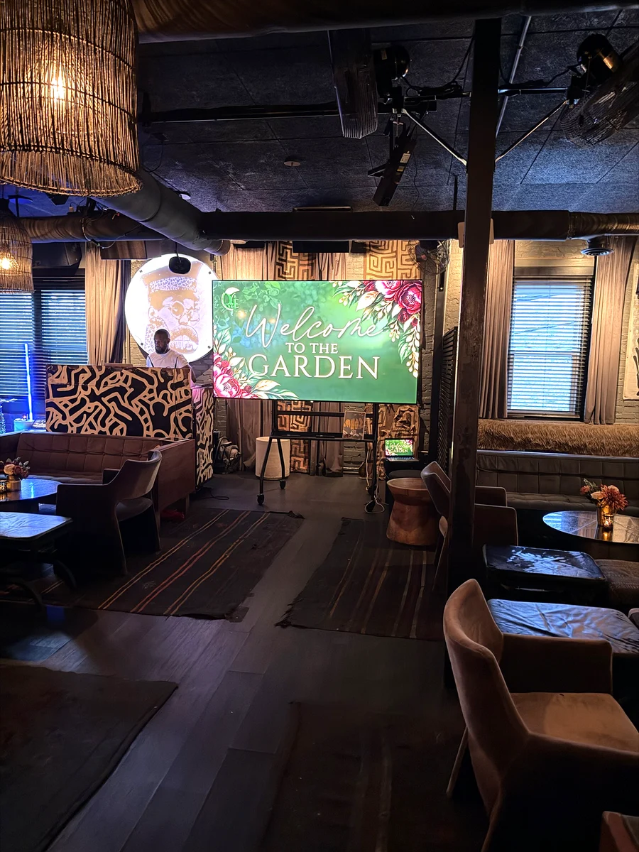
On October 16, the garden came to life in Midtown. The welcome slide greeted guests on the main screen, and printed welcome signs met them at the bar and the welcome table. The recap brings the designs and the room together.
The welcome slide on the nightRecap of the night (35 sec, room sound)
06 The Impact
One visual world carried guests from the first save-the-date to the last signature cocktail, giving a global mission a warm, human introduction.
“She became more than my graphic designer. She became a trusted creative and visual partner. Having Nina help turn those ideas into something people can actually see, understand, and connect with has been invaluable.”
Shirley Xavier, Founder, YE Foundation & The Xchange Agency
Completed through Nina Simmons Designs, Inc. Invitations and signage are shown in mockups created for this portfolio; event photo and footage in “The Night” are from the evening.
Morris Brown College Foundation:One evening. One visual presence.
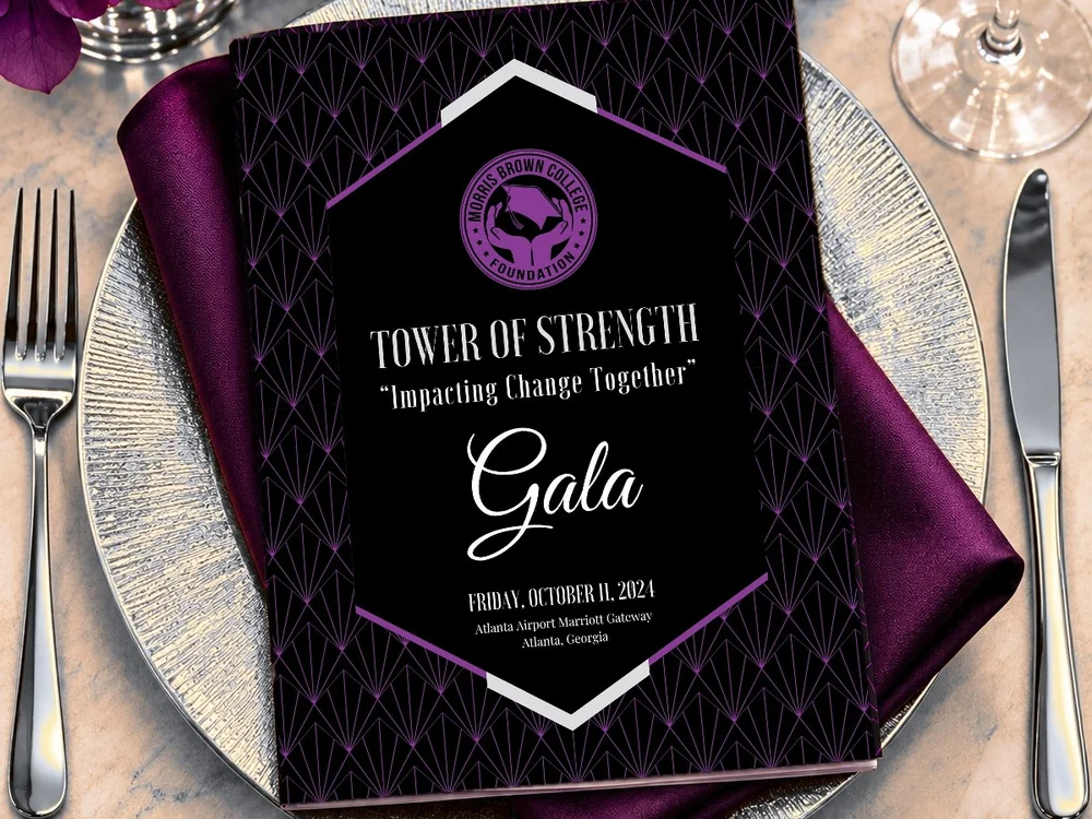
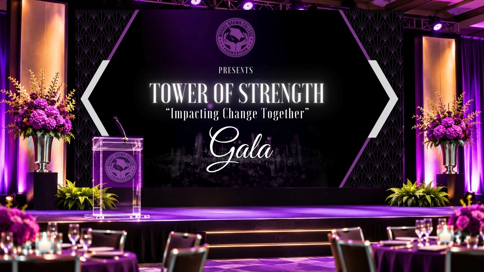
For the 2024 Tower of Strength Gala, I designed every piece guests saw, from the screens above the stage to the program in their hands and the number on their table.
The animated title slide, looping on screen as guests arrived
02 Project Overview
Client
Morris Brown College Foundation
Event
Tower of Strength Gala, October 11, 2024, Atlanta
Engagement
Through Nina Simmons Designs, Inc.
Scope
Event Design System · Presentation Design · Print & Signage · Program Booklet
Creative Leadership
Developed the gala’s coordinated visual communications across the event program, menus, signage, presentation materials, and supporting collateral.
Impact
Created a cohesive visual experience across guest-facing materials, supporting event communication, recognition, and the presentation of the foundation’s mission.
03 The Challenge
A fundraising gala asks a lot of its materials. The same evening has to honor eleven leaders, thank dozens of sponsors, move guests from check-in to dinner to auction, and invite every person in the room to give.
Each piece is read at a different distance: a screen across the ballroom, a sign at the door, a program in hand, a card on the table. They all had to feel like one night.
04 The Creative Direction
A tower of strength, framed in art deco.
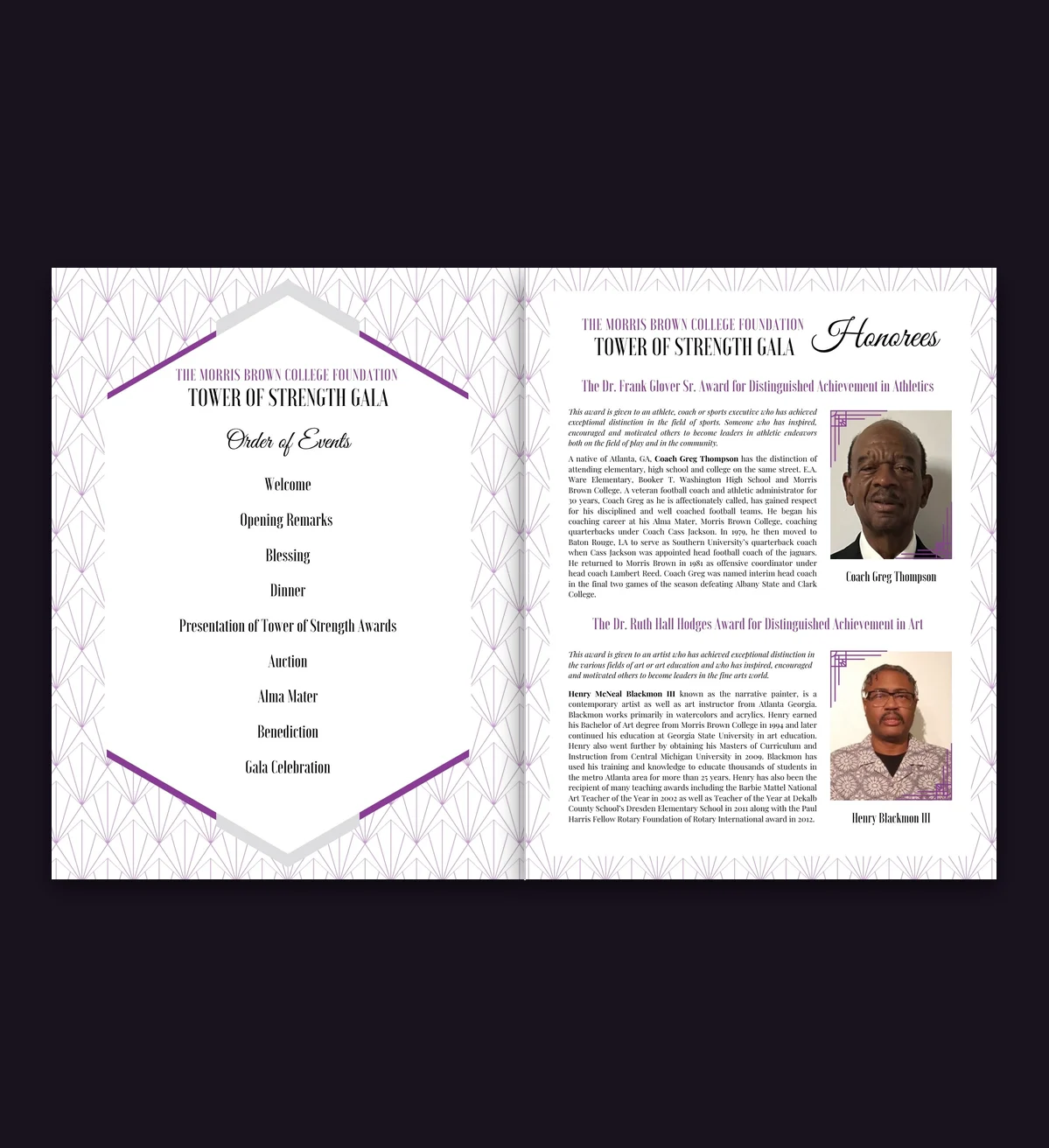
The Tower of Strength theme called for a visual identity that felt distinguished, celebratory, and unified. I developed an art deco-inspired system using geometric patterns, a signature hexagonal frame, a rich black-and-purple palette, and expressive typography.
The challenge was making that identity work at every scale—from a ballroom presentation screen to a printed program, directional signage, and individual table cards. Each application needed to serve a different purpose while remaining unmistakably part of the same event.
05 The Work
01 The Stage Experience
The run of show, from the welcome to the last sponsor.
A 59-slide presentation carried the program: speaker introductions, the president’s welcome, honoree moments, and sponsor recognition by tier, with a sponsor loop between segments.
The identity in the ballroom (mockup)
02 The Honorees
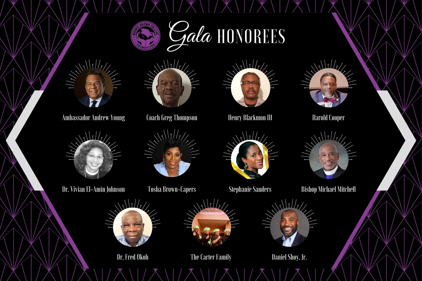
Eleven leaders, one board.
A 36-by-24-inch board introduced the evening’s honorees by name and portrait, with each photo set in a sunburst so no one honoree outranks another.
The honorees board, 36 x 24 in
03 In the Room
Signage that guides without breaking the mood.
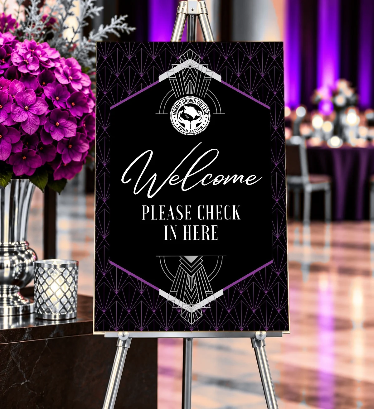
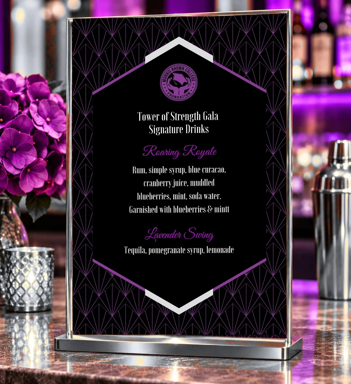
Signs moved guests through the night, from check-in to the VIP reception, the silent and live auctions, and the bar, alongside a 24-by-36-inch board thanking every sponsor by tier.
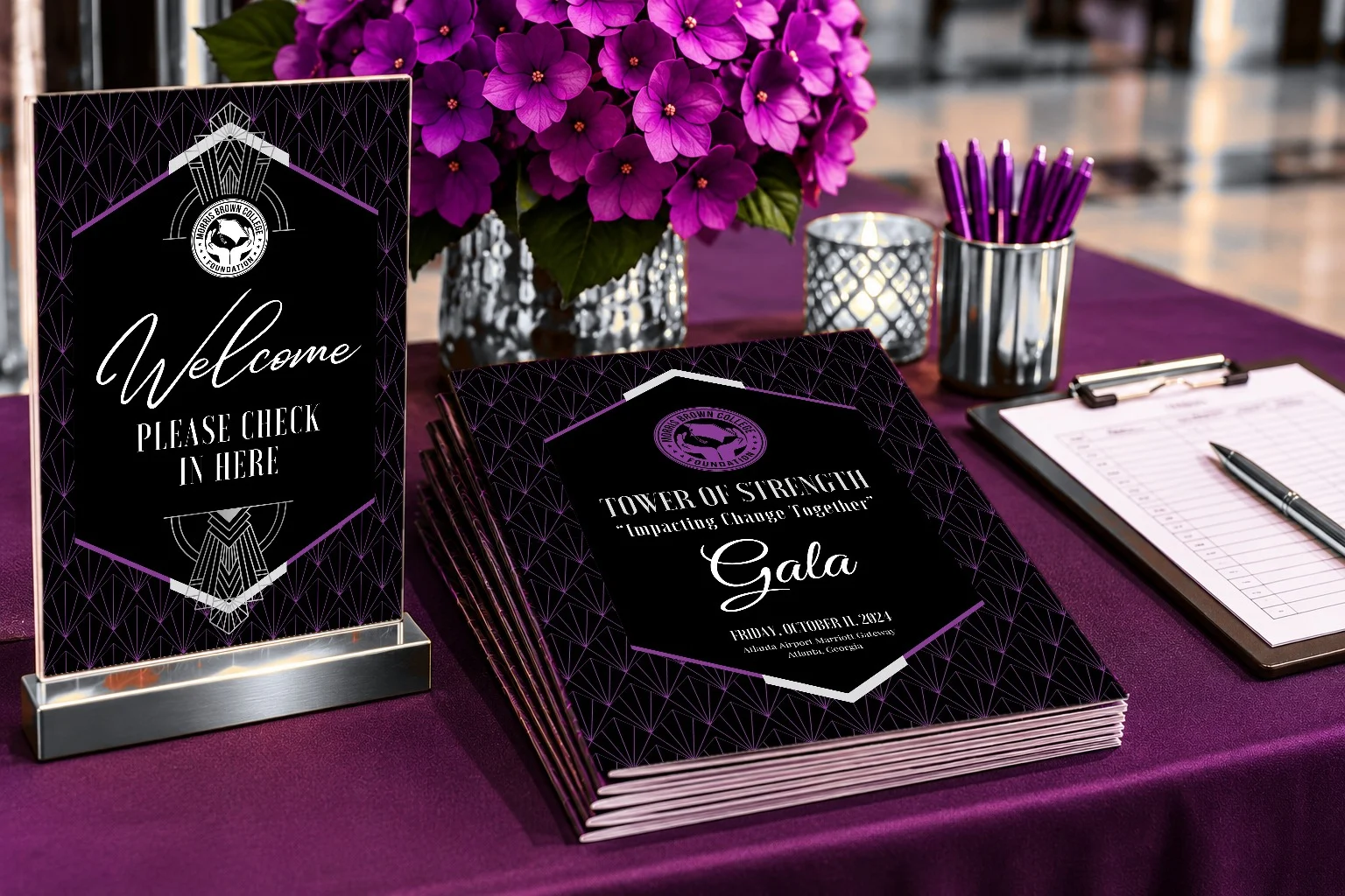
Registration: check-in sign and programs (mockup)Welcome sign at the entrance (mockup)Signature drinks at the bar (mockup)
04 At the Table
Where guests spend the most time.
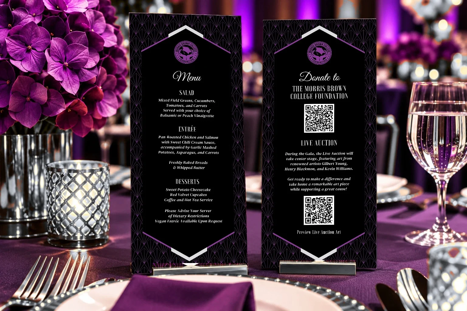
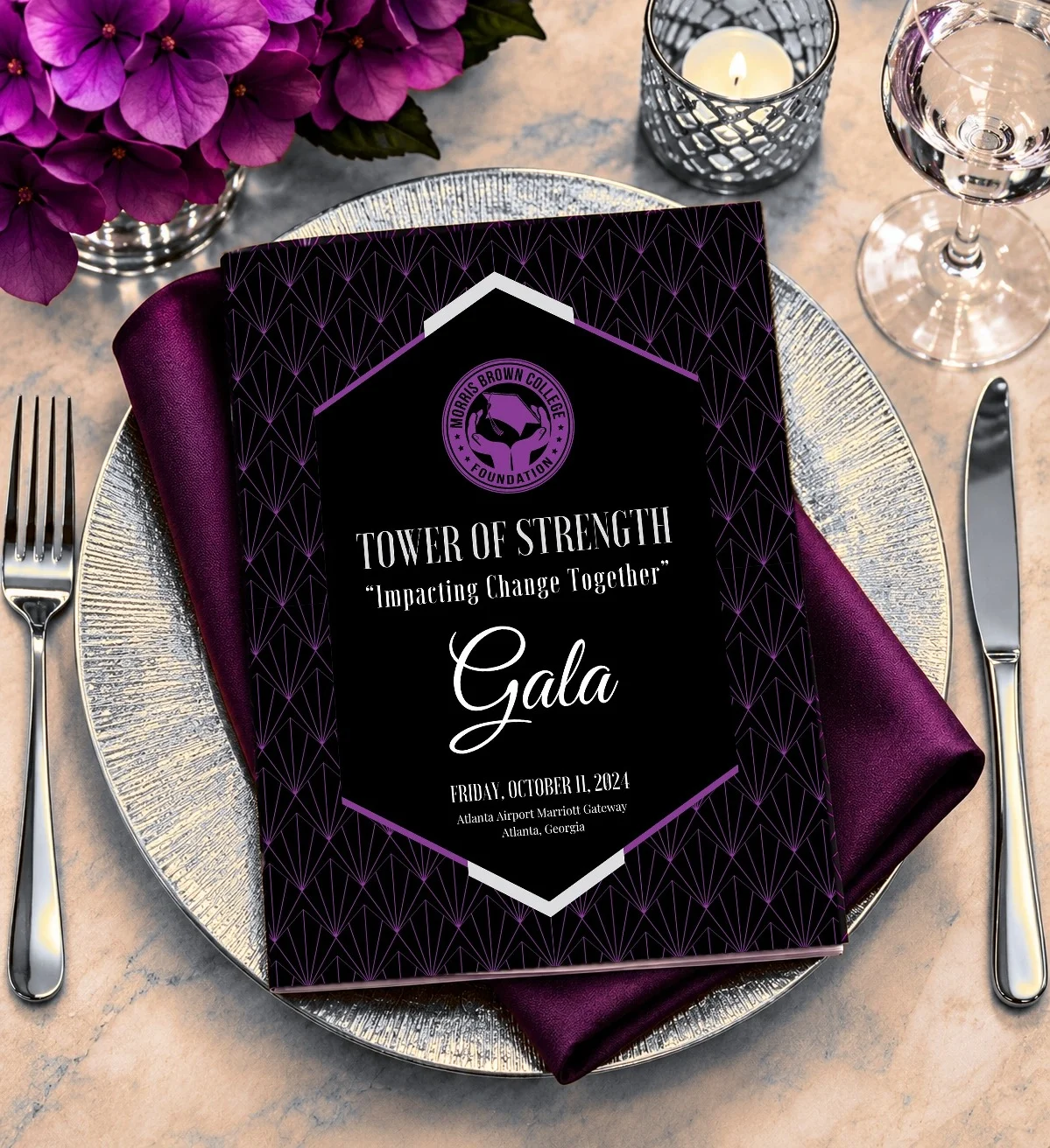
The menu, a giving card with QR codes for donations and the live auction, table numbers, place cards, and a 24-page program carried the frame down to the smallest size. The program held the order of events, letters of greeting, the foundation’s history, and a page for every honoree.
Menu and giving card (mockup)The program at each place setting (mockup)Inside the program
06 The Impact
The result was a cohesive visual experience that connected every stage of the gala—from arrival and registration to honoree recognition, sponsor visibility, dinner, and fundraising.
Rather than designing each piece independently, I created a flexible event identity that worked across presentation, print, signage, and guest-facing materials. The system gave the evening a consistent presence while allowing each element to communicate clearly in its own setting.
Completed through Nina Simmons Designs, Inc. Honoree and sponsor names and logos belong to their owners. Pieces marked “mockup” show the original designs placed in AI-generated scenes.
In fall 2025, I joined TK Elevator’s North America marketing department as a creative consultant for the company’s annual Sales Team Summit. The job was to take what leadership needed to say and make it land with a room of sales executives.
Illustrative image, recreated for this portfolio. Not an original summit asset.
02 Project Overview
Client
TK Elevator
Industry
Corporate · Elevators & mobility
Engagement
Contract creative consultant, fall 2025
Scope
Executive Communications · Creative Direction · Presentation Systems
Creative Leadership
Provided creative development and design support for a corporate sales summit, translating business priorities into presentation and event communications.
Impact
Supported a coordinated, professional summit experience through clear messaging and consistent visual execution.
03 The Challenge
TK Elevator needed to communicate business priorities and strategic information to its sales organization through a cohesive presentation experience.
The challenge was translating complex information from multiple stakeholders into clear, engaging, and consistent executive communications.
04 My Role
Working with marketing and senior leadership, I supported the creative direction and development of presentation materials for the annual Sales Team Summit.
My focus was on visual storytelling, information hierarchy, brand consistency, and creating presentation experiences that supported the message rather than competing with it.
05 The Approach
I worked to bring clarity and consistency to the presentation materials by organizing information, establishing visual hierarchy, and translating complex content into more accessible communication.
The work required balancing executive expectations, business objectives, and established corporate brand standards.
1Executive inputPriorities from leadership and multiple stakeholders
2Message hierarchyWhat matters most, and in what order
3Visual systemOne presentation look within the corporate brand
4The roomKeynotes, sales sessions, and training that read as one summit
Illustrative diagram of my approach, from executive input to the room
06 The Value
This engagement demonstrates my ability to operate within a corporate environment, collaborate across functions, and turn complex business information into focused visual communication.
The full presentation materials are not displayed due to limited access to the originals.
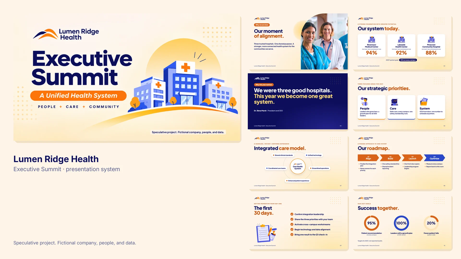
An executive summit presentation for a health system in the middle of a merger: one idea, one visual system, and twelve slides built to help 300 leaders leave with the same three priorities.
Speculative project. Lumen Ridge Health is fictional, and every person, number, and quote is invented. It shows the presentation craft behind my executive communications work without using any client’s material.
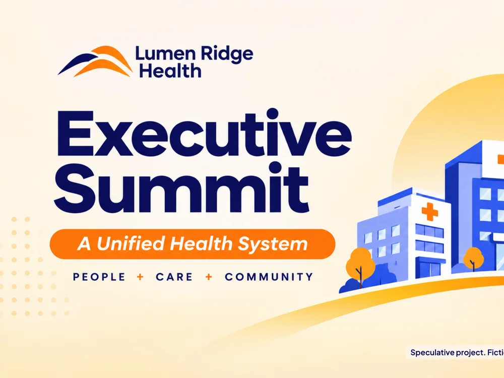
The slide system: twelve slides on one shared horizon
02 Project Overview
Type
Speculative project
Format
12-slide summit deck and template kit
Audience
300 leaders from three merged hospitals
Scope
Executive Communications · Presentation Systems · Information Design
Creative Leadership
Developed the creative concept, visual storytelling, and presentation system for a speculative healthcare leadership summit, translating complex organizational priorities into a clear executive narrative.
Impact
Demonstrated how strategic presentation design can align organizational priorities, communicate performance indicators, and turn a complex healthcare transformation scenario into an actionable leadership roadmap.
03 The Brief
Lumen Ridge has just merged three community hospitals. Its first combined leadership summit has one job: align 300 leaders on one strategy for the year, so every campus leaves working toward the same three priorities.
The insight: these leaders don’t resist the strategy. They resist losing what made their hospital theirs. The deck had to show that one system raises their standard rather than erasing their identity.
04 The Idea
Three hospitals, one sunrise.
The key visual puts the three campuses side by side on one hill as the sun rises behind them: separate buildings, one shared horizon. The deck carries that warmth through every slide with a cream-to-sunrise background, bold headlines with one orange phrase, and an orange pill that names each section. “People + Care + Community” closes the day as the system’s promise.
05 The Work
01 The System
Built for every speaker, not just the keynote.
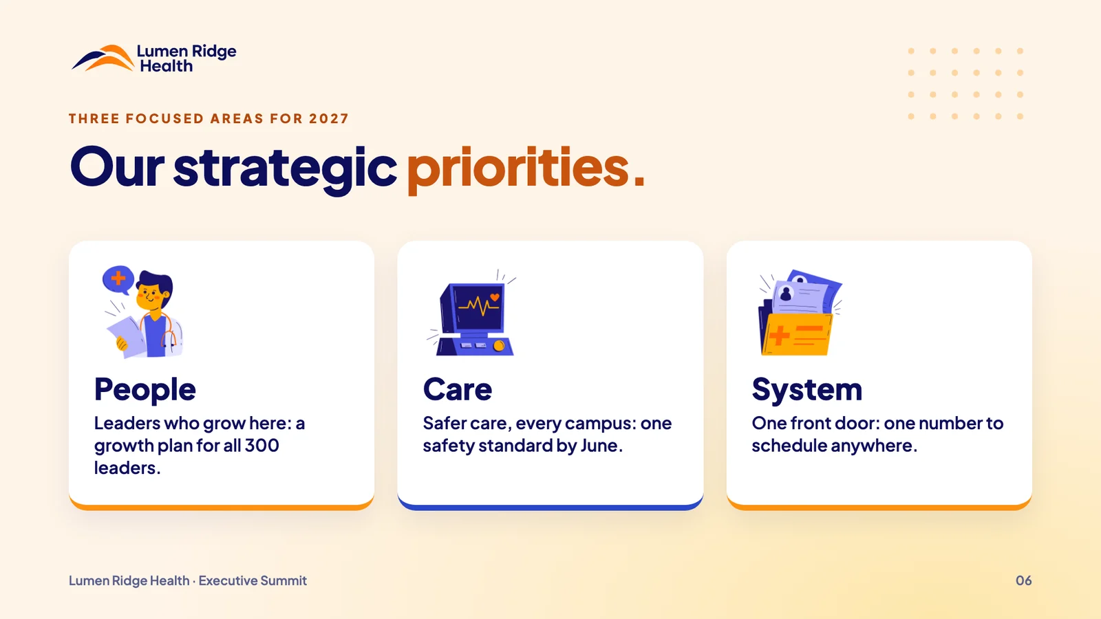
A small set of repeatable parts (the section pill, a headline with one highlighted phrase, white stat cards, and one illustration per idea) lets any presenter build on-brand slides without a designer in the room.
People, Care, and System: the three priorities
02 Key Slides
One idea per slide. One number to remember.
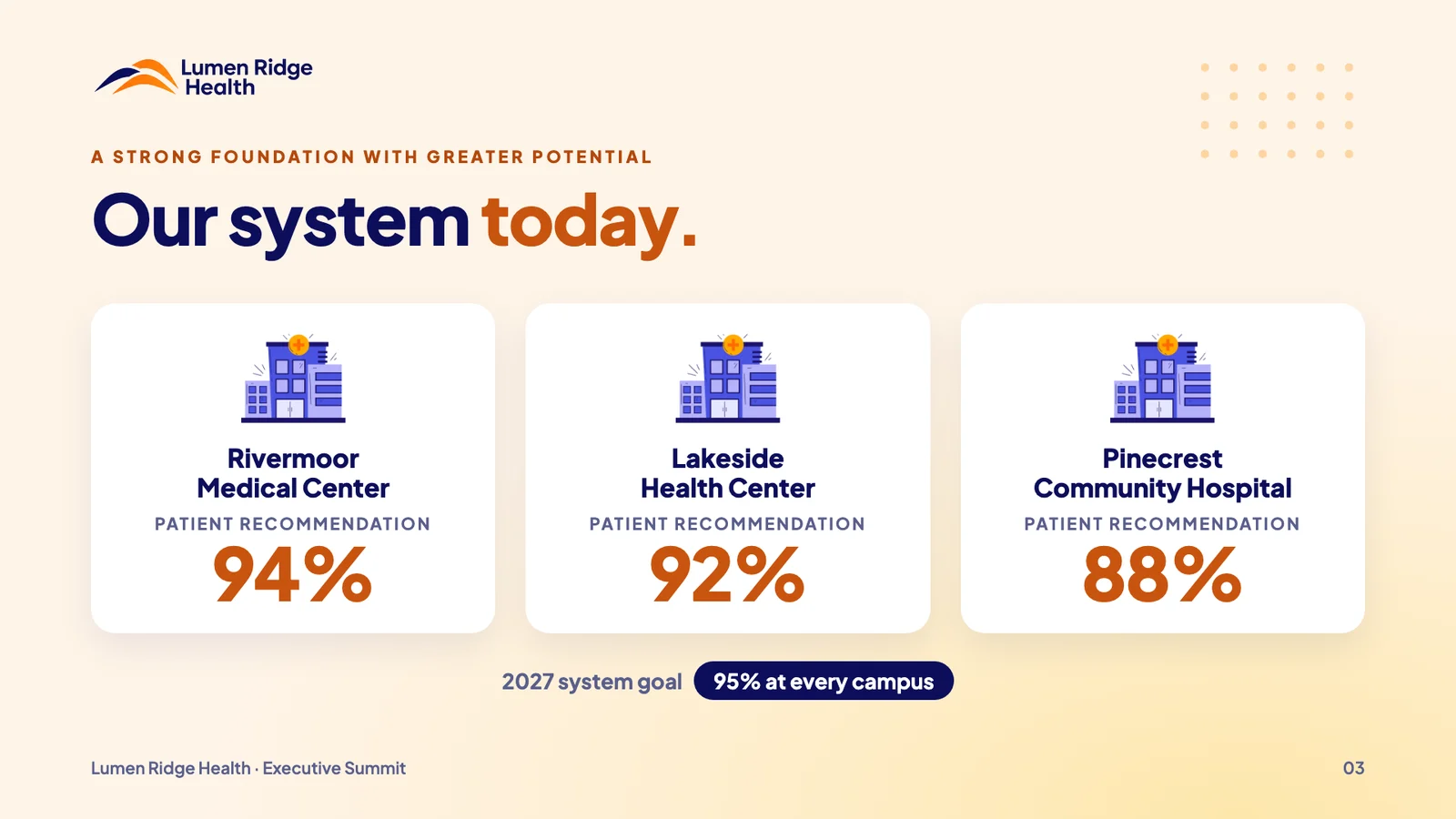
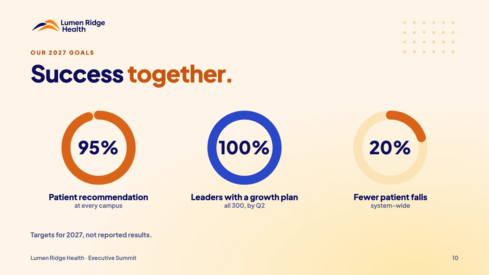
The story moves from people to proof to plan: why we are here, where each campus stands, the model that connects them, and what happens next. Every number is either today’s baseline or clearly labeled as a 2027 target.
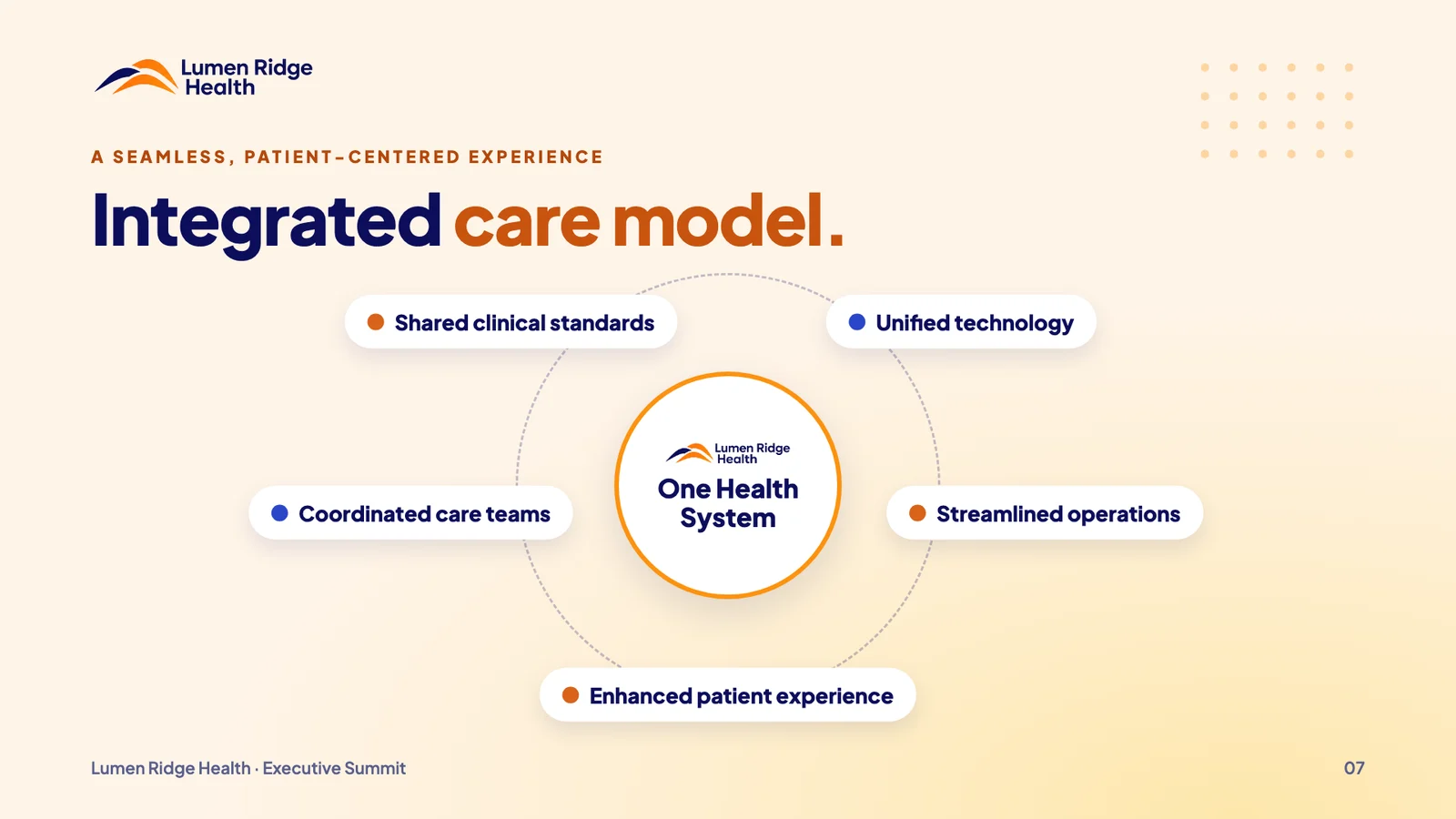
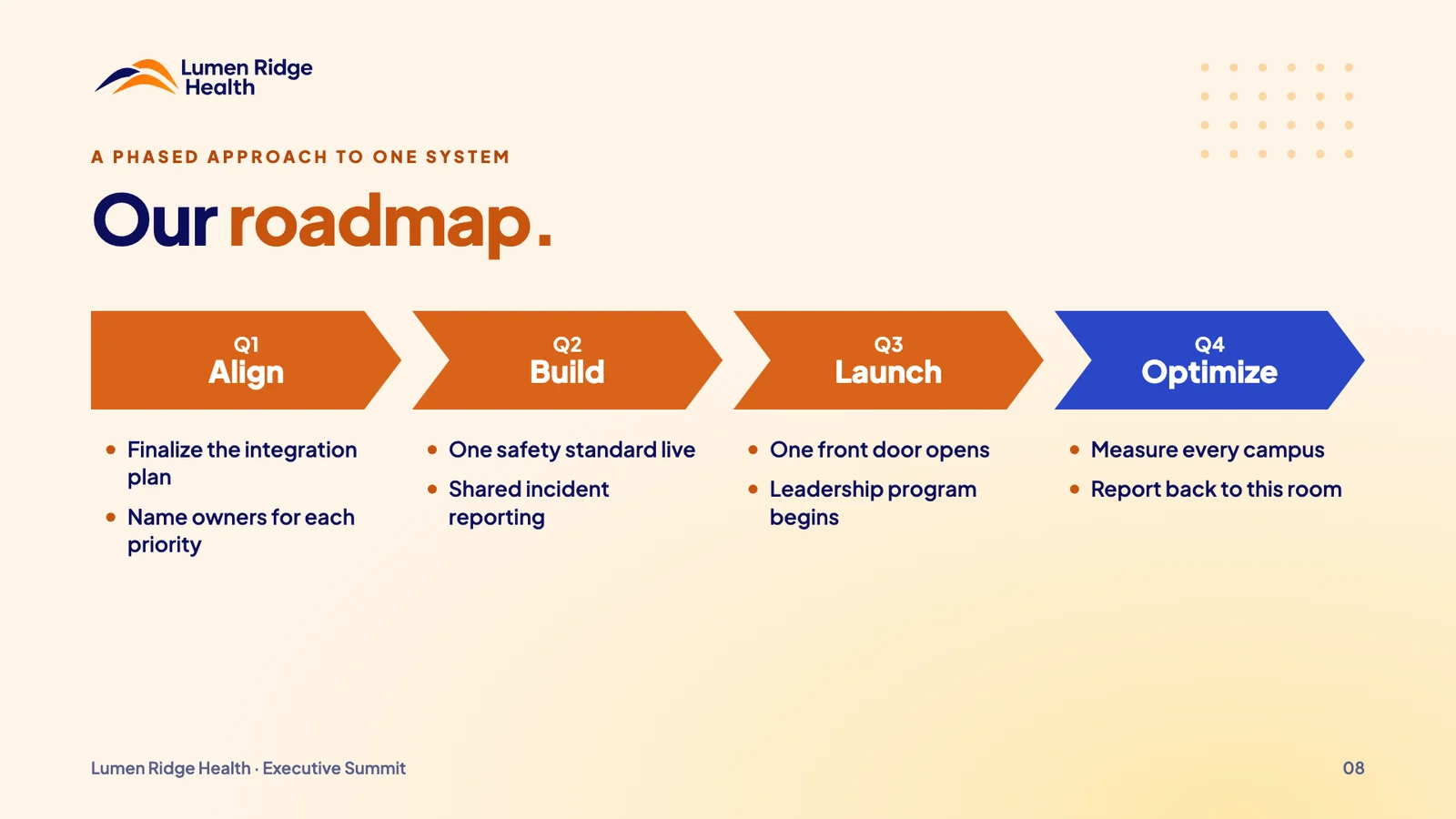
Opening: our moment of alignmentThree campuses, one goalThe integrated care modelRoadmap2027 goals, labeled as targets
Executive communication is editing before it is design: deciding what matters most, in what order, and giving a room of leaders one thing to carry out the door.
Speculative project. Fictional company, people, and data. Not affiliated with any health system. Photography and spot illustrations licensed from Envato Elements.